Intro
Disclaimer: This article is intended for an audience already familiar with MAUI. Explanations are concise and may be challenging for beginners.
Welcome to this series of articles where we’ll build a complete Design System library of custom controls in MAUI. This article builds on the previous one MAUI (Library Part 5) Extending Control Behavior with Button.
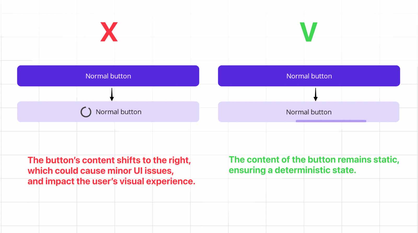
Using a Progress Bar at the bottom of a button is a better choice, in my opinion, compared to an icon with a spinning loader for indicating loading states.
The main issue with a spinning icon is that it must be hidden when the button is in its normal state. When the loading state is triggered, the appearance of the icon often shifts the text to the side (left or right) or, worse, changes the button’s width.
This creates visual disruption, leading to a less fluid and polished user experience. A Progress Bar avoids these issues, providing a seamless and consistent way to display loading feedback without altering the button’s layout.
Here’s my perspective illustrated in pictures:
Goal
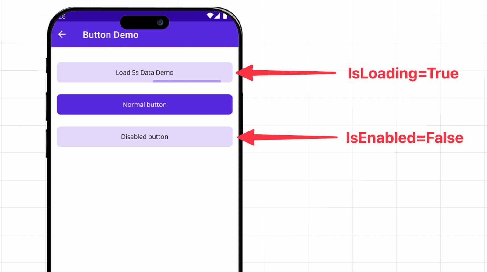
We will enhance the button component by coupling it with a Progress Bar. The IsLoading property activates the Progress Bar when set to true, while maintaining the button’s visual state through the IsEnabled property.
The final result will look like this:
Implement the Progress Bar component
MAUI provides a Progress Bar control, but it lacks animation; we aim for a bar that smoothly moves from left to right.
Note that the CommunityToolkit offers a ProgressBar Animation Behavior, which animates a ProgressBar from its current value to a specified value over time. This method takes a double progress value, a uint duration in milliseconds, and an Easing enum value.
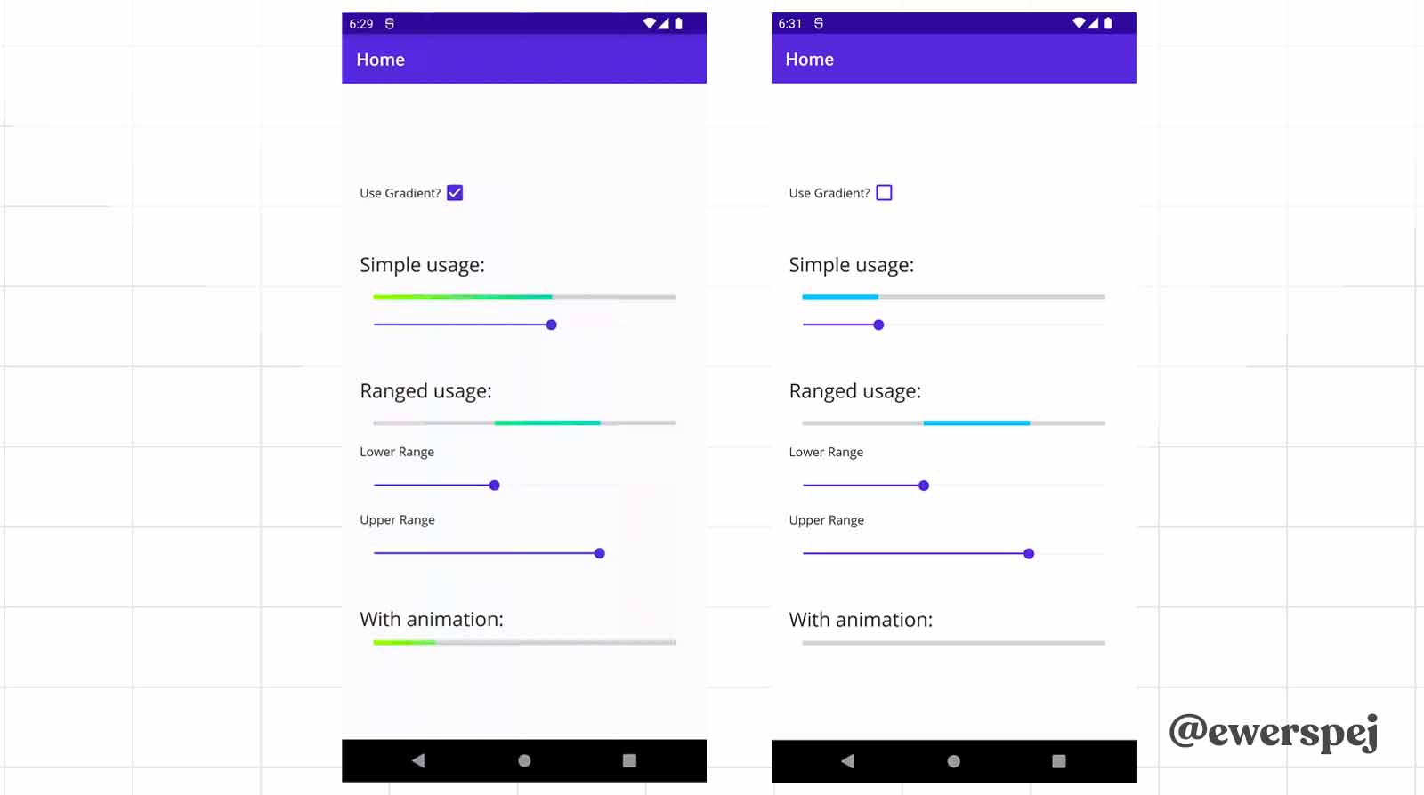
It still lacks support for an indeterminate state, where the bar continuously moves from left to right. To resolve this, I decided to adopt the excellent solution provided by ewerspej, which demonstrates how to implement a custom Progress Bar using SkiaSharp.
The choice of this library was deliberate for several reasons:
- Simplicity: The implementation is concise, requiring just two files, making it easy to integrate directly into the project.
- Performance: SkiaSharp is known for its high-performance rendering, ensuring smooth animations without compromising the app’s responsiveness.
- Control: By embedding the code directly rather than importing it as an external package, we avoid unnecessary dependency on third-party libraries.
The implementation and its capabilities are illustrated below (images sourced from @ewerspej’s GitHub):
Create the Custom Button control
We created a new control called CButton. The name ‘Button’ is reserved due to its partial class, so we used ‘C’ for ‘Custom’ to distinguish it.
–> Blog_MAUI_Components.MAUI/CustomControls/Buttons/CButton.xaml.cs
public partial class CButton
{
    private const string LowerKey = "lower";
    private const string UpperKey = "upper";

    private readonly Animation _lowerAnimation;
    private readonly Animation _upperAnimation;

    public static readonly BindableProperty TextProperty =
        BindableProperty.Create(nameof(Text), typeof(string), typeof(CButton),
            defaultBindingMode: BindingMode.OneWay, propertyChanged: TextChanged);
    public static readonly BindableProperty IsLoadingProperty =
        BindableProperty.Create(nameof(IsLoading), typeof(bool), typeof(CButton),
            defaultBindingMode: BindingMode.OneWay, propertyChanged: IsLoadingChanged);
    public static readonly BindableProperty CommandProperty =
        BindableProperty.Create(nameof(Command), typeof(ICommand), typeof(CButton));
    public static readonly BindableProperty CommandParameterProperty =
        BindableProperty.Create(nameof(CommandParameter), typeof(object), typeof(CButton));

    public string Text
    {
        get => (string)GetValue(TextProperty);
        set => SetValue(TextProperty, value);
    }

    public bool IsLoading
    {
        get => (bool)GetValue(IsLoadingProperty);
        set => SetValue(IsLoadingProperty, value);
    }

    public ICommand? Command
    {
        get => (ICommand?)GetValue(CommandProperty);
        set => SetValue(CommandProperty, value);
    }

    public object? CommandParameter
    {
        get => GetValue(CommandParameterProperty);
        set => SetValue(CommandParameterProperty, value);
    }

    public CButton()
    {
        InitializeComponent();

        _lowerAnimation = new Animation(v =>
            AnimatedProgressBar.LowerRangeValue = (float)v, start: -0.4, end: 1.0);
        _upperAnimation = new Animation(v =>
            AnimatedProgressBar.UpperRangeValue = (float)v, start: 0.0, end: 1.4);
    }

    private static void TextChanged
        (BindableObject bindable, object oldValue, object newValue)
            => ((CButton)bindable).UpdateTextView();
    private static void IsLoadingChanged
        (BindableObject bindable, object oldValue, object newValue)
            => ((CButton)bindable).UpdateIsLoadingView();

    private void Button_OnClicked(object? sender, EventArgs e)
    {
        if (Command != null && Command.CanExecute(CommandParameter))
        {
            Command.Execute(CommandParameter);
        }
    }

    private void UpdateTextView()
    {
        Button.Text = Text;
    }

    private void UpdateIsLoadingView()
    {
        Button.IsEnabled = !IsLoading;
        AnimatedProgressBar.IsVisible = IsLoading;

        if (IsLoading)
        {
            _lowerAnimation.Commit(owner: this, name: LowerKey,
                length: 1000, easing: Easing.CubicInOut, repeat: () => true);
            _upperAnimation.Commit(owner: this, name: UpperKey,
                length: 1000, easing: Easing.CubicInOut, repeat: () => true);
        }
        else
        {
            this.AbortAnimation(handle: LowerKey);
            this.AbortAnimation(handle: UpperKey);
        }
    }
}
Here’s a breakdown of the properties:
- Text: Defines the text displayed on the button.
- IsLoading: Determines if the button is in a loading state. Disables the button and shows a progress bar when true.
- Command: Binds an action to be executed when the button is clicked.
- CommandParameter: Provides additional data for the Command execution.
The animations use the Animation class to interpolate values for the LowerRangeValue and UpperRangeValue of the progress bar, creating smooth transitions. They are triggered when IsLoading is true, looping indefinitely with a cubic easing function for fluid motion. When IsLoading is false, the animations are stopped to reset the progress bar’s state.
You can easily extend this control by adding more bindable properties as needed, following the same pattern used for properties like Text and IsEnabled.
Let’s define the view in XAML by including a Button and a ProgressBar:
–> Blog_MAUI_Components.MAUI/CustomControls/Buttons/CButton.xaml
<Grid
    xmlns="http://schemas.microsoft.com/dotnet/2021/maui"
    xmlns:x="http://schemas.microsoft.com/winfx/2009/xaml"
    xmlns:ccp="clr-namespace:Blog_MAUI_Components.MAUI.CustomControls.ProgressBars"
    xmlns:ccb="clr-namespace:Blog_MAUI_Components.MAUI.CustomControls.Buttons"
    x:Class="Blog_MAUI_Components.MAUI.CustomControls.Buttons.CButton"
    x:DataType="ccb:CButton">

    <Button
        x:Name="Button"
        Clicked="Button_OnClicked"/>

    <ccp:ProgressBar
        x:Name="AnimatedProgressBar"
        IsVisible="False"
        Margin="6, 0"
        HeightRequest="5"
        UseRange="True"
        RoundCaps="True"
        VerticalOptions="End"
        ProgressColor="{StaticResource PrimaryDark}" />

</Grid>
Display CButton control in a page
Let’s implement our custom control into a page.
You might be tempted to add an IsLoading property to your ViewModel to manage the button’s state, right? Well, let me strongly discourage you from doing that.
Implementing properties like IsLoading, ErrorMessage, etc., which are directly tied to your Command state, can lead to unnecessary complexity and redundancy.
Instead, I’ll demonstrate how to integrate this using the TaskLoaderCommand from Sharpnado.Maui.TaskLoaderView for a more efficient approach.
Check out the excellent article TaskLoaderView 2.0: Let’s burn IsBusy=true!
It’s a must-read to improve your app’s stability while reducing boilerplate code. It was originally written for Xamarin, but a new package is now available for MAUI. The object structure remains unchanged, making the existing documentation still relevant.
Instead of using an ICommand, we will utilize a TaskLoaderCommand, which inherits from ICommand. One of its key features is a property named Notifier.
Notifier exposes several useful properties such as ShowLoader, ShowRefresher, ShowResult, ShowError, ShowEmptyState, and more, providing robust state management for your commands.
Let’s implement a TaskLoaderCommand linked to the DemoOneAsync method in our ButtonPageViewModel:
–> Blog_MAUI_Components/Presentation/Pages/Buttons/ButtonPageViewModel.cs
public class ButtonPageViewModel : ViewModelBase
{
    private readonly ILogger<ButtonPageViewModel> _logger;

    public TaskLoaderCommand DemoOneCommand { get; }

    public ButtonPageViewModel(
        ILogger<ButtonPageViewModel> logger)
    {
        _logger = logger;

        DemoOneCommand = new TaskLoaderCommand(DemoOneAsync);

        _logger.LogInformation("Building ButtonPageViewModel");
    }

    private async Task DemoOneAsync()
    {
        _logger.LogInformation("DemoOne()");

        await Task.Delay(5000);
    }
}
As mentioned earlier, we are focusing on the Notifier, specifically the ShowLoader property. This value becomes true while the command is executing its task.
Let’s bind the IsLoading property of our control to the Notifier.ShowLoader property from the TaskLoaderCommand:
–> Blog_MAUI_Components/Presentation/Pages/Buttons/ButtonPage.xml
<base:ContentPageBase
    xmlns="http://schemas.microsoft.com/dotnet/2021/maui"
    xmlns:x="http://schemas.microsoft.com/winfx/2009/xaml"
    x:Class="Blog_MAUI_Components.Presentation.Pages.Buttons.ButtonPage"
    xmlns:ccb="clr-namespace:Blog_MAUI_Components.MAUI.CustomControls.Buttons;
               assembly=Blog_MAUI_Components.MAUI"
    xmlns:page="clr-namespace:Blog_MAUI_Components.Presentation.Pages.Buttons"
    xmlns:base="clr-namespace:Blog_MAUI_Components.Presentation.Common"
    Title="Button Demo"
    x:DataType="page:ButtonPageViewModel">

    <Grid RowDefinitions="*,Auto" >
        <ScrollView>
            <VerticalStackLayout
                Margin="16, 32"
                Spacing="25">

                <ccb:CButton
                    Text="Load 5s Data Demo"
                    IsLoading="{Binding DemoOneCommand.Notifier.ShowLoader}"
                    Command="{Binding DemoOneCommand}" />

                <ccb:CButton
                    Text="Normal button" />

                <ccb:CButton
                    Text="Disabled button"
                    IsEnabled="False" />

            </VerticalStackLayout>
        </ScrollView>
    </Grid>
</base:ContentPageBase>
Implement the IsEnabled state
Did you try setting IsEnabled to true or false? You might have noticed that the button’s state doesn’t change. This happens because IsEnabled was not explicitly defined in our custom control. Instead, it is inherited from the Grid control, which is the base container.
However, we want to customize its behavior to directly control the IsEnabled property of the Button, not the Grid.
To achieve this, we need to monitor changes to the IsEnabled property and update the Button accordingly. This can be done by overriding the OnPropertyChanged method and specifically detecting changes to IsEnabledProperty.
–> Blog_MAUI_Components.MAUI/CustomControls/Buttons/CButton.xaml.cs
public partial class CButton
{
    // Properties ...

    public CButton()
    {
        InitializeComponent();

        // Constructor ...
    }

    // Methods ...

    protected override void OnPropertyChanged(string? propertyName = null)
    {
        base.OnPropertyChanged(propertyName);

        if (propertyName == IsEnabledProperty.PropertyName)
        {
            UpdateIsEnabledView();
        }
    }

    // Methods ...

    private void UpdateIsEnabledView()
    {
        Button.IsEnabled = IsEnabled;
    }
}
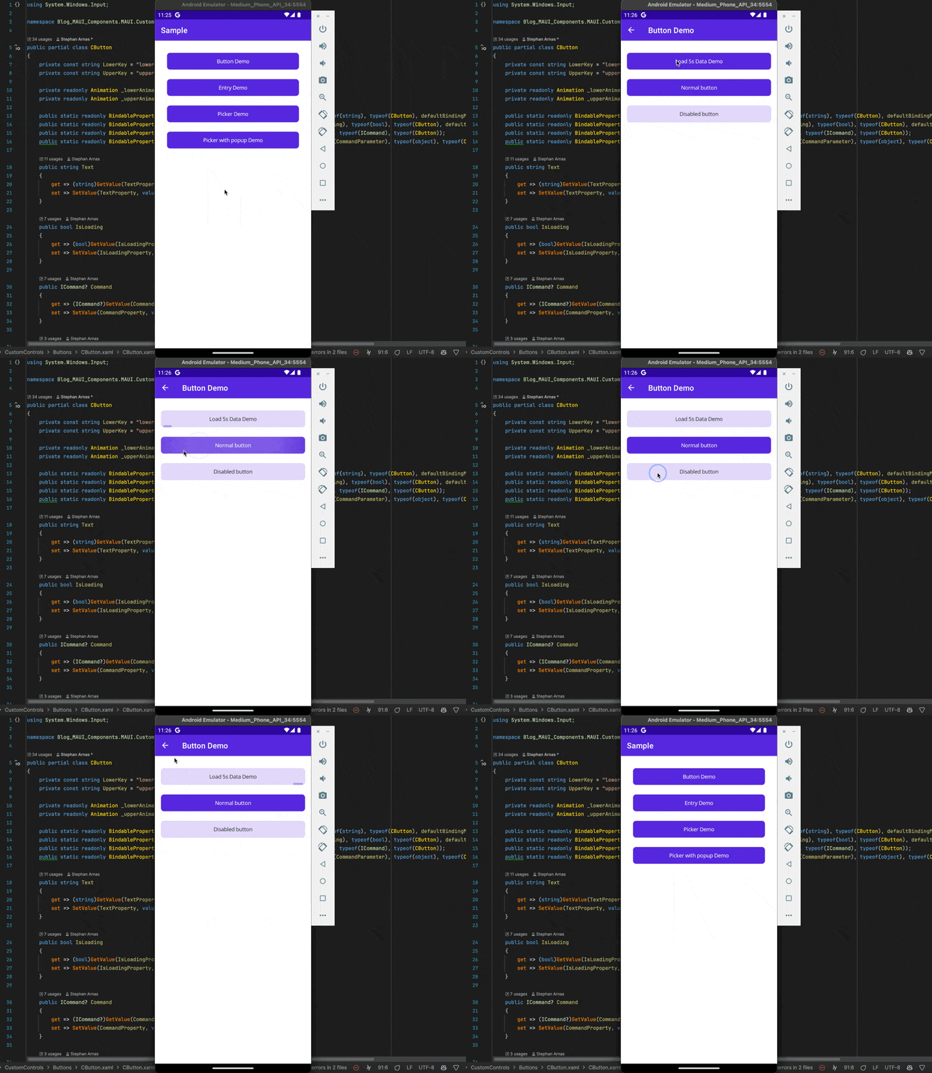
See it in action
Let’s see the CButton in action.
Conclusion
The full code is available on GitHub, with a working example.
In this article, we enhanced the button component in our MAUI Design System by integrating a Progress Bar with a custom CButton control. This implementation introduces an IsLoading property for visual feedback and demonstrates the integration of the TaskLoaderCommand for state management.
We also addressed button state handling and explored how to bind properties like ShowLoader for seamless UI updates, creating a responsive and interactive user experience.
If you enjoyed this blog post, then follow me on LinkedIn, subscribe the newsletter so you don’t miss out on any future posts. Don’t forget to share this with your friends and colleagues who are interested in learning about this topic. Thank you 🥰
Happy coding!


