Intro
Disclaimer: This article is intended for an audience already familiar with MAUI. We keep the explanations tight and straightforward for beginners.
Welcome to this series of articles where we’ll build a complete Design System library of custom controls in MAUI. This article builds on the previous one, (Library Part 3) Loading state with Picker Label.
Goal
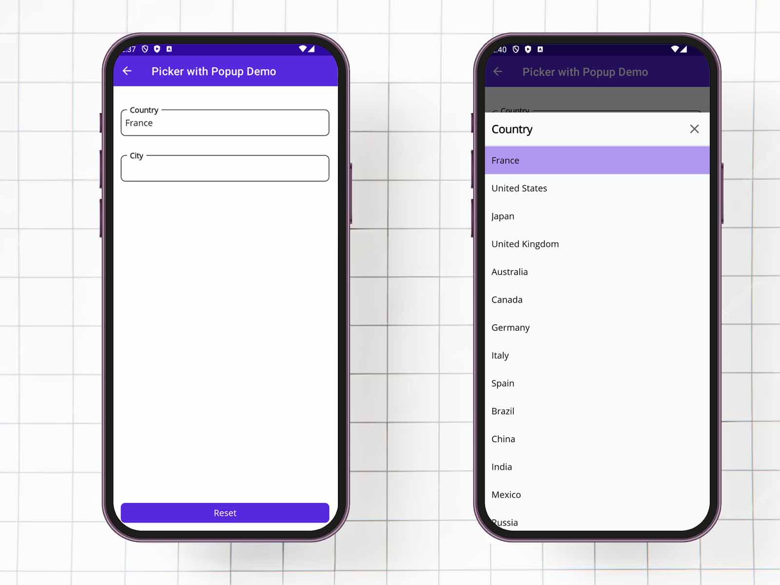
We will create a new control named PickerPopupLabel. This control will use the same properties and behave similarly to the PickerLabel we built in the previous article. When clicked, instead of using the native picker, it will open a custom Popup that displays a header and a CollectionView, providing our own picker implementation.
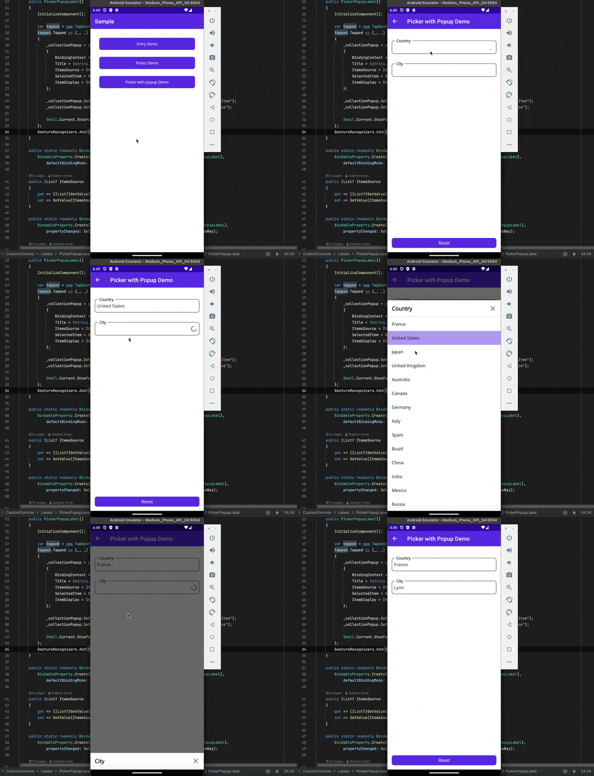
The final result will look like this:
Structure of the project
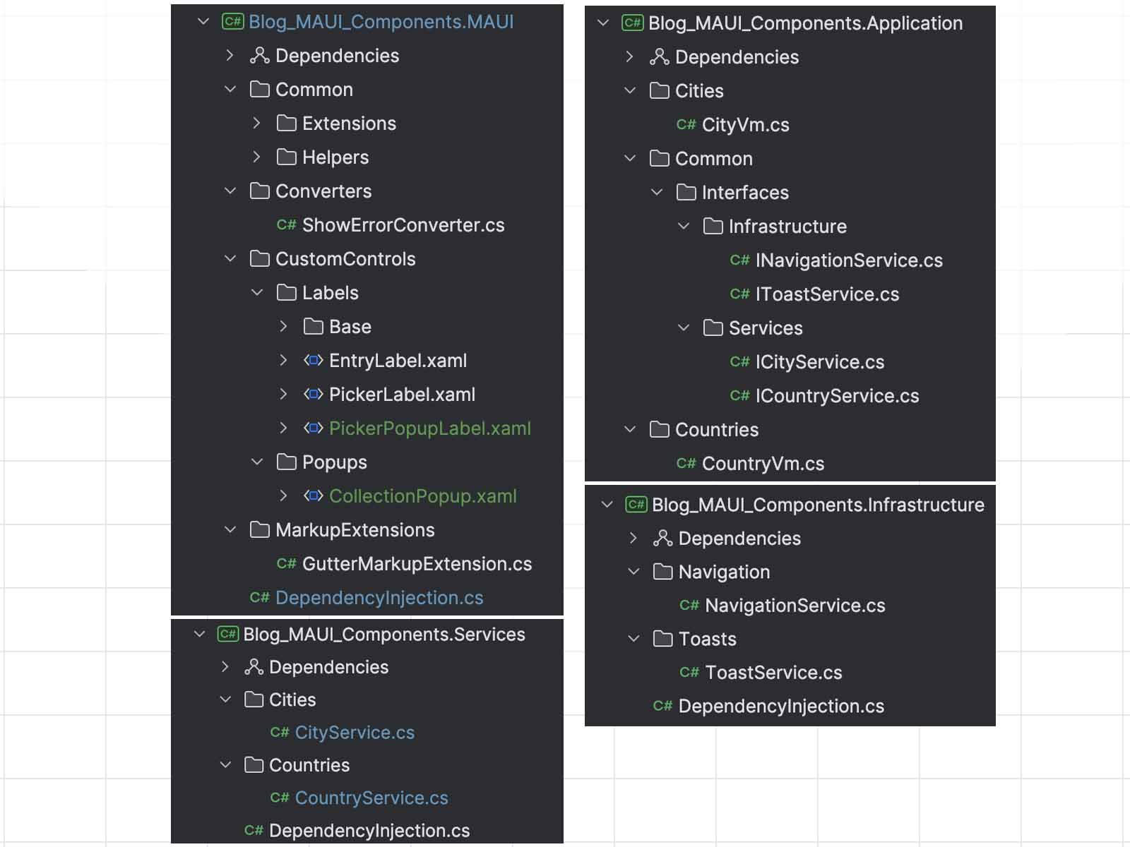
I updated the project structure to align it with an enterprise-level application, implementing clean architecture to separate the layers.
- Blog_MAUI_Components: Main project contains the MAUI mobile application, designed to run on Android and iOS platforms. It includes all the pages, UI logic, and user interactions.
- Blog_MAUI_Components.MAUI: This layer helps us to build the desing of our pages. It contains custom controls, converters, markup extensions, and other UI-related components.
- Blog_MAUI_Components.Application: This layer is dedicated to the domain model objects. It defines the mapping between contracts and domain models and manages the core business logic of the application.
- Blog_MAUI_Components.Infrastructure: This layer manages the core services such as HTTP communication, navigation, popups, authentication, persistence, and other foundational services that the application depends on.
- Blog_MAUI_Components.Services: This layer implements the repository pattern, interacting with backend services to retrieve and manipulate data. It ensures seamless communication between the application and the backend.
I don’t have a backend for this demo project, so I simulate HTTP requests by using a delay and returning static data.
I’ll explain this approach in a future article, but for now, feel free to explore the repository to get a better understanding of the structure if you’re not already familiar with it.
Create a new control: CollectionPopup
We previously created the PickerLabel and EntryLabel controls, inheriting the LabelBase control. LabelBase manages labeling, error messages and info messages and combines native MAUI control, the Picker and Entry.
For the new PickerPopupLabel, we need to create a custom control that doesn’t exist in MAUI. This new control will bind a Popup control from the CommunityToolkit.Maui package and use a CollectionView to display the source items.
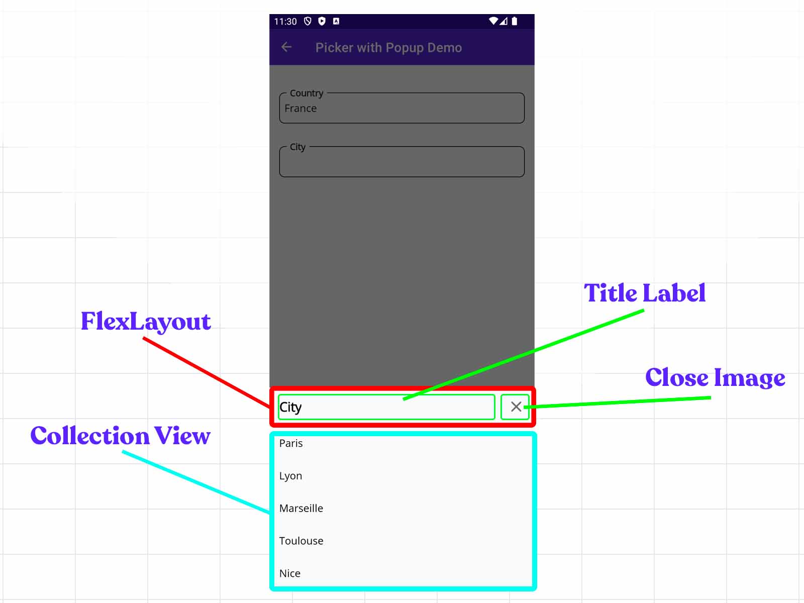
The CollectionPopup is inherited from the Popup, and contains style resources and a grid for organizing elements.
–> Blog_MAUI_Components.MAUI/CustomControls/Popups/CollectionPopup.xaml
<toolkit:Popup
    HorizontalOptions="Fill"
    VerticalOptions="End"
    x:Class="Blog_MAUI_Components.MAUI.CustomControls.Popups.CollectionPopup"
    x:Name="This"
    xmlns="http://schemas.microsoft.com/dotnet/2021/maui"
    xmlns:toolkit="http://schemas.microsoft.com/dotnet/2022/maui/toolkit"
    xmlns:x="http://schemas.microsoft.com/winfx/2009/xaml"
    xmlns:markup="clr-namespace:
        Blog_MAUI_Components.MAUI.MarkupExtensions;assembly=Blog_MAUI_Components.MAUI">

    <toolkit:Popup.Resources>
        <Style TargetType="Grid" x:Key="BottomPopupRootGrid">
            <Setter Property="MinimumWidthRequest"
                    Value="{x:Static markup:GutterSystem.WidthScreen}" />
            <Setter Property="BackgroundColor"
                    Value="{AppThemeBinding
                        Light={StaticResource PageBackground},
                        Dark={StaticResource PageBackgroundDark}}" />
        </Style>
        <Style TargetType="Image" x:Key="ClosePopupImage">
            <Setter Property="WidthRequest" Value="26" />
            <Setter Property="HeightRequest" Value="26" />
            <Setter Property="HorizontalOptions" Value="End" />
        </Style>
        <Style TargetType="Label" x:Key="TitlePopupLabel">
            <Setter Property="FontSize" Value="20" />
            <Setter Property="FontAttributes" Value="Bold" />
            <Setter Property="HorizontalOptions" Value="StartAndExpand" />
        </Style>
        <Style TargetType="Rectangle" x:Key="BreakLineRectangle">
            <Setter Property="Fill" Value="{DynamicResource Gray100}" />
            <Setter Property="HeightRequest" Value="2" />
            <Setter Property="HorizontalOptions" Value="StartAndExpand" />
        </Style>
    </toolkit:Popup.Resources>

    <Grid
        BindingContext="{x:Reference This}"
        RowDefinitions="Auto,Auto"
        Style="{StaticResource BottomPopupRootGrid}">

        <VerticalStackLayout>
            <VerticalStackLayout Padding="16">
                <FlexLayout
                    AlignItems="Center"
                    HeightRequest="26"
                    JustifyContent="SpaceBetween">

                    <Label
                        Style="{StaticResource TitlePopupLabel}"
                        x:Name="TitleLabel" />

                    <Image
                        Style="{StaticResource ClosePopupImage}"
                        x:Name="CloseImage"
                        Source="close.png" />

                </FlexLayout>
            </VerticalStackLayout>
            <Rectangle Style="{StaticResource BreakLineRectangle}" />
        </VerticalStackLayout>

        <CollectionView
            Grid.Row="1"
            ItemSizingStrategy="MeasureFirstItem"
            ItemsLayout="VerticalList"
            ItemsSource="{Binding ItemsSource}"
            SelectionMode="Single"
            x:Name="PickerCollectionView" />

    </Grid>

</toolkit:Popup>
The result of the structure looks like that:
–> Blog_MAUI_Components.MAUI/CustomControls/Popups/CollectionPopup.xaml.cs
public partial class CollectionPopup
{
    public CollectionPopup()
    {
        InitializeComponent();

        var tapped = new TapGestureRecognizer();
        tapped.Tapped += (_, _) => Close();
        CloseImage.GestureRecognizers.Add(tapped);
    }

    public static readonly BindableProperty TitleProperty =
        BindableProperty.Create("Title", typeof(string), typeof(CollectionPopup),
        propertyChanged: TitleChanged, defaultBindingMode: BindingMode.OneWayToSource);

    public string Title
    {
        get => (string)GetValue(TitleProperty);
        set => SetValue(TitleProperty, value);
    }

    public static readonly BindableProperty ItemsSourceProperty =
        BindableProperty.Create("ItemsSource", typeof(IList), typeof(CollectionPopup));

    public IList? ItemsSource
    {
        get => (IList?)GetValue(ItemsSourceProperty);
        set => SetValue(ItemsSourceProperty, value);
    }

    public static readonly BindableProperty SelectedItemProperty =
        BindableProperty.Create("SelectedItem", typeof(object),
        typeof(CollectionPopup), defaultBindingMode: BindingMode.TwoWay);

    public object? SelectedItem
    {
        get => GetValue(SelectedItemProperty);
        set => SetValue(SelectedItemProperty, value);
    }

    public static readonly BindableProperty ItemDisplayProperty =
        BindableProperty.Create("ItemDisplay", typeof(string), typeof(CollectionPopup),
        defaultBindingMode: BindingMode.OneWayToSource);

    public string? ItemDisplay
    {
        get => (string?)GetValue(ItemDisplayProperty);
        set
        {
            SetValue(ItemDisplayProperty, value);
            InitCollectionViewItems();
        }
    }

    private static void TitleChanged
        (BindableObject bindable, object oldValue, object newValue) =>
            ((CollectionPopup)bindable).UpdateTitleView();

    private void UpdateTitleView() => TitleLabel.Text = Title;

    private void InitCollectionViewItems()
    {
        PickerCollectionView.ItemTemplate = new DataTemplate(() =>
        {
            var contentView = new ContentView
            {
                HorizontalOptions = LayoutOptions.Fill,
                VerticalOptions = LayoutOptions.Fill,
                Padding = new Thickness(16, 14),
                WidthRequest = GutterSystem.WidthScreen,
                BackgroundColor = Colors.Transparent
            };

            contentView.Triggers.Add(new DataTrigger(typeof(ContentView))
            {
                Binding = new Binding("."),
                Value = SelectedItem,
                Setters =
                {
                    new Setter
                    {
                        Property = VisualElement.BackgroundColorProperty,
                        Value = ResourceHelper.GetThemeColor("PrimaryDark", "Primary")
                    }
                }
            });

            var tapGestureRecognizer = new TapGestureRecognizer();
            tapGestureRecognizer.Tapped += (s, _) =>
            {
                SelectedItem = ((ContentView)s!).BindingContext;
                Close();
            };
            contentView.GestureRecognizers.Add(tapGestureRecognizer);

            var label = new Label
            {
                FontSize = 16,
                HorizontalOptions = LayoutOptions.Fill,
                LineBreakMode = LineBreakMode.TailTruncation
            };

            label.SetBinding(Label.TextProperty, new Binding(ItemDisplay));

            contentView.Content = label;

            return contentView;
        });

        PickerCollectionView.MaximumHeightRequest = GutterSystem.HeightScreen / 1.3;
    }
}
Here’s a simple explanation of the BindableProperty in this component. They are named and work in the same way as those used in the CollectionView :
- Title: Title of the popup.
- ItemsSource: Holds the collection of items to be displayed in the CollectionView.
- SelectedItem: Selected item from the CollectionView. The value is bound in a two-way mode, so when the user selects an item, it updates this property, and vice versa.
- ItemDisplay: Defines the name of the property to be displayed for each item in the CollectionView.
The ItemTemplate is defined in the code-behind because I noticed the binding wasn’t working correctly when I tried to set it up in the XAML view. The ItemTemplate consists of a ContentView that wraps a Label to display the item’s value. In addition, there’s a TapGestureRecognizer that updates the SelectedItem with the item the user has clicked on, then closes the pop-up.
Create a new control: PickerPopupLabel
If you’ve read my previous articles, you’re now familiar with how to implement a new control and encapsulate it in our LabelBase control.
Let’s create our PickerPopupLabel control. This control will include a Label inside the View to display the selected item from the Picker. The functionality to open the CollectionPopup will be handled in the code-behind, where the magic happens.
–> Blog_MAUI_Components.MAUI/CustomControls/Labels/PickerPopupLabel.xaml
<base:LabelBase
    xmlns="http://schemas.microsoft.com/dotnet/2021/maui"
    xmlns:x="http://schemas.microsoft.com/winfx/2009/xaml"
    xmlns:base="clr-namespace:Blog_MAUI_Components.MAUI.CustomControls.Labels.Base"
    x:Class="Blog_MAUI_Components.MAUI.CustomControls.Labels.PickerPopupLabel">

    <base:LabelBase.Resources>
        <Style x:Key="LabelLabel" TargetType="Label">
            <Setter Property="FontSize" Value="16" />
            <Setter Property="TextColor" Value="{StaticResource Gray950}" />
            <Setter Property="VerticalOptions" Value="CenterAndExpand" />
            <Setter Property="VerticalTextAlignment" Value="Center" />
            <Setter Property="HorizontalOptions" Value="StartAndExpand" />
            <Setter Property="MinimumHeightRequest" Value="40" />
        </Style>
    </base:LabelBase.Resources>

    <base:LabelBase.View>
        <Label
            Style="{StaticResource LabelLabel}"
            x:Name="Element" />
    </base:LabelBase.View>
</base:LabelBase>
The code-behind is quite long, so I will remove the BindableProperty section to make it shorter.
–> Blog_MAUI_Components.MAUI/CustomControls/Labels/PickerPopupLabel.xaml.cs
public partial class PickerPopupLabel
{
    private CollectionPopup? _collectionPopup;
    private object? _previousSelectedItem;

        public PickerPopupLabel()
    {
        InitializeComponent();

        var tapped = new TapGestureRecognizer();
        tapped.Tapped += (_, _) =>
        {
            _collectionPopup = new CollectionPopup
            {
                BindingContext = this,
                Title = !string.IsNullOrEmpty(Title) ? Title : Label,
                ItemsSource = ItemsSource,
                SelectedItem = SelectedItem,
                ItemDisplay = ItemDisplay,
            };

            _collectionPopup
                .SetBinding(CollectionPopup.SelectedItemProperty, "SelectedItem");
            _collectionPopup
                .SetBinding(CollectionPopup.ItemsSourceProperty, "ItemsSource");

            // ShowPopup is coming from CommunityToolkit.Maui package.
            Shell.Current.ShowPopup(_collectionPopup);
        };
        GestureRecognizers.Add(tapped);
    }

    // Bindable properties such as:
    // - ItemsSource
    // - SelectedItem,
    // - TapCommand
    // - ItemDisplay
    // - DefaultValue
    // - Title

    // Check the code on GitHub to see the complete implementation.

    private void UpdateSelectedItemView()
    {
        TapCommand?.Execute(SelectedItem);
        Element.Text =
            SelectedItem?.GetPropertyValue<string>(ItemDisplay) ?? string.Empty;
    }

    private void UpdateDefaultValueView()
    {
        Element.Text = DefaultValue;
    }
}
In the constructor, a TapGestureRecognizer is added to the control to detect when the user taps on it.
We create a new instance of CollectionPopup, initializing all properties. Binding the SelectedItem of the CollectionPopup to the SelectedItem of the PickerPopupLabel allows us to trigger a PropertyChanged event.
This event triggers the UpdateSelectedItemView method. The Element control, which represents the Label, needs to update its value with the selected item. To achieve this, we require reflection, I created an extension method that retrieves the value of a property from an object using its property name.
–> Blog_MAUI_Components.MAUI/Common/Extensions/ObjectExtension.xaml.cs
public static class ObjectExtension
{
    public static T GetPropertyValue<T>(this object? item, string? propertyName)
    {
        ArgumentNullException.ThrowIfNull(item);

        if (string.IsNullOrEmpty(propertyName))
        {
            throw new ArgumentNullException(nameof(propertyName));
        }

        var type = item.GetType();
        var propertyInfo = type.GetProperty(propertyName);

        if (propertyInfo == null)
        {
            throw new ArgumentException($"Property {propertyName} was not found in the object {type.Name}");
        }

        return (T)propertyInfo.GetValue(item)!;
    }
}
Display PickerPopupLabel in a page
The mechanism is in place, so let’s display our new control on a page.
I created a new page called PickerPopupPage, but I want to associate it with the PickerPageViewModel. The business logic will remain the same as the PickerPage.
–> Blog_MAUI_Components/Presentation/Pages/Pickers/PickerPopupPage.xaml.cs
<base:ContentPageBase
    xmlns="http://schemas.microsoft.com/dotnet/2021/maui"
    xmlns:x="http://schemas.microsoft.com/winfx/2009/xaml"
    xmlns:ccl="clr-namespace:
    Blog_MAUI_Components.MAUI.CustomControls.Labels;assembly=Blog_MAUI_Components.MAUI"
    xmlns:base="clr-namespace:Blog_MAUI_Components.Presentation.Common"
    xmlns:page="clr-namespace:Blog_MAUI_Components.Presentation.Pages.Pickers"
    Title="Picker with Popup Demo"
    x:DataType="page:PickerPageViewModel"
    x:Class="Blog_MAUI_Components.Presentation.Pages.Pickers.PickerPopupPage">

    <Grid RowDefinitions="*,Auto" >
        <ScrollView>
            <VerticalStackLayout
                Margin="16, 32"
                Spacing="25">

                <ccl:PickerPopupLabel
                    Label="Country"
                    SelectedItem="{Binding Country}"
                    ItemsSource="{Binding CountriesLoader.Result}"
                    ItemDisplay="{x:Static
                        page:PickerPageViewModel.CountryDisplayProperty}"
                    TapCommand="{Binding CountrySelectedCommand}"
                    ShowLoader="{Binding CountriesLoader.ShowLoader}" />

                <ccl:PickerPopupLabel
                    Label="City"
                    SelectedItem="{Binding City}"
                    ItemsSource="{Binding CitiesLoader.Result}"
                    ItemDisplay="{x:Static
                        page:PickerPageViewModel.CityDisplayProperty}"
                    ShowLoader="{Binding CitiesLoader.ShowLoader}" />

            </VerticalStackLayout>
        </ScrollView>
    </Grid>

</base:ContentPageBase>
See it in action
Conclusion
The full code is available on GitHub, with a working example.
In this article, we extended our previous work by building a custom PickerPopupLabel control using a CollectionView and Popup, providing a more flexible and user-friendly picker implementation compared to the default platform picker. Stay tuned for future articles where we’ll continue to enhance this design system.
If you enjoyed this blog post, then follow me on LinkedIn, subscribe the newsletter so you don’t miss out on any future posts. Don’t forget to share this with your friends and colleagues who are interested in learning about this topic. Thank you 🥰
Happy coding!


