Intro
Disclaimer: This article is intended for an audience already familiar with MAUI. We keep the explanations tight and straightforward for beginners.
Welcome to this series of articles where we’ll build a complete Design System library of custom controls in MAUI. This article builds on the previous one (Library Part 4) Custom Picker with Collection View and Popup.
Goal
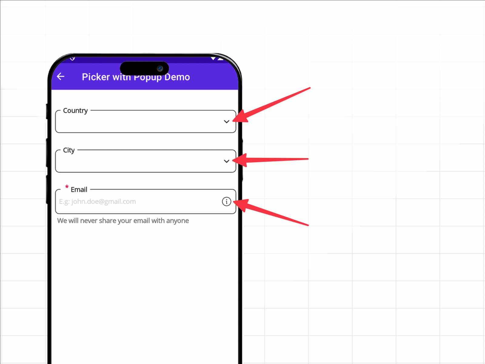
We will enhance LabelBase by adding new properties: ActionIconSource to set the image and ActionIconCommand to handle the business logic when the button is pressed.
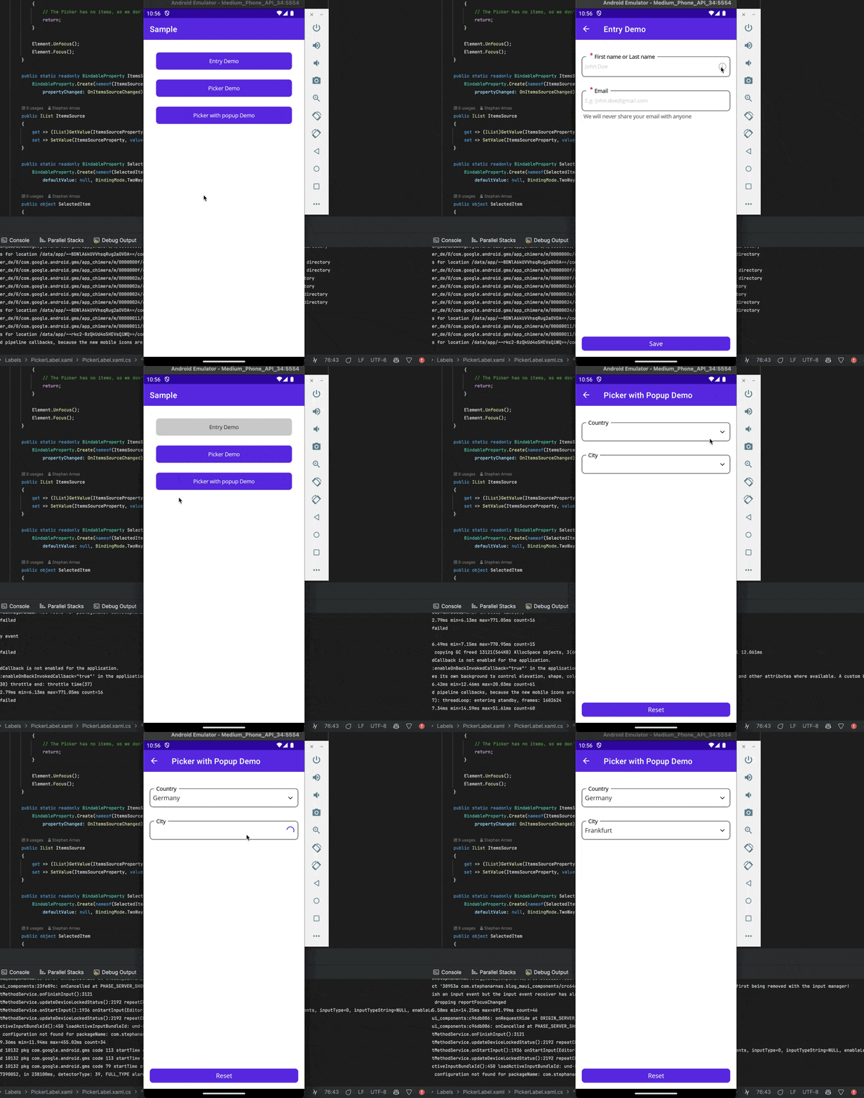
The final result will look like this:
Add new Properties to LabelBase
A quick reminder about the meaning of LabelBase, it manages labeling, error messages and info messages and combines native MAUI control, the Picker and Entry, check the first article for the description (Library Part 1) Create a Custom Entry using SkiaSharp
Now, we will enhance LabelBase with a new feature: the ability to display a button on the right side. To achieve this, we’ll add two new properties:
- ActionIconSource: specifies the image to display for the action button.
- ActionIconCommand: a ICommand to define the business logic to execute when the action button is pressed.
–> Blog_MAUI_Components.MAUI/CustomControls/Labels/Base/LabelBase.xaml.cs
public partial class LabelBase
{
    public LabelBase()
    {
        InitializeComponent();
    }

    // All properties: View, IsRequired, Label, Info, Error, ShowLoader, etc.

    public static readonly BindableProperty ActionIconSourceProperty =
        BindableProperty.Create(nameof(ActionIconSource), typeof(ImageSource),
        typeof(LabelBase), defaultValue: null, propertyChanged: ActionIconSourceChanged);

    public ImageSource? ActionIconSource
    {
        get => (ImageSource?)GetValue(ActionIconSourceProperty);
        set => SetValue(ActionIconSourceProperty, value);
    }

    public static readonly BindableProperty ActionIconCommandProperty =
        BindableProperty.Create(nameof(ActionIconCommand), typeof(ICommand),
        typeof(LabelBase), defaultValue: null, propertyChanged: ActionIconCommandChanged);

    public ICommand? ActionIconCommand
    {
        get => (ICommand?)GetValue(ActionIconCommandProperty);
        set => SetValue(ActionIconCommandProperty, value);
    }

    // All changed methods: ElementChanged, IsRequiredChanged, LabelChanged,
    // InfoChanged, ErrorChanged, ShowLoaderChanged, etc.

    private static void ActionIconSourceChanged
        (BindableObject bindable, object oldValue, object newValue)
            => ((LabelBase)bindable).UpdateActionIconSourceView();
    private static void ActionIconCommandChanged
        (BindableObject bindable, object oldValue, object newValue)
            => ((LabelBase)bindable).UpdateActionIconCommandView();

    // All UpdateView methods: UpdateElementView, UpdateIsRequiredView, UpdateLabelView,
    // UpdateInfoView, UpdateErrorView, UpdateShowLoaderView, etc.

    private void UpdateActionIconSourceView()
    {
        // The button is visible only if we define a picture image.
        ActionIconButton.IsVisible = ActionIconSource is not null;
        ActionIconButton.Source = ActionIconSource;
    }

    private void UpdateActionIconCommandView()
    {
        ActionIconButton.Command = ActionIconCommand;
    }
}
On the UI side, to display the button, I’ll use an ImageButton. It’s perfect control for showing an image with button functionality. It allows us to assign a Command to handle the click action.
–> Blog_MAUI_Components.MAUI/CustomControls/Labels/Base/LabelBase.xaml
<Grid
    xmlns="http://schemas.microsoft.com/dotnet/2021/maui"
    xmlns:x="http://schemas.microsoft.com/winfx/2009/xaml"
    xmlns:skia="clr-namespace:SkiaSharp.Views.Maui.Controls;assembly=SkiaSharp.Views.Maui.Controls"
    RowDefinitions="Auto,Auto,Auto"
    x:Class="Blog_MAUI_Components.MAUI.CustomControls.Labels.Base.LabelBase"
    Margin="0, 10, 0, 0">

   <Grid.Resources>
        <!-- All the styles -->
   </Grid.Resources>

    <!-- Label -->
    <!-- Border Canvas View -->
    <!-- Border Label -->
    <!-- Info Label -->
    <!-- Error Label -->
    <!-- Activity Loader -->

    <ImageButton x:Name="ActionIconButton"
                 IsVisible="False"
                 HorizontalOptions="End"
                 VerticalOptions="Center"
                 BackgroundColor="Transparent"
                 WidthRequest="24"
                 HeightRequest="24"
                 Margin="0, 0, 8, 0" />

</Grid>
Update the page PickerPopupPage
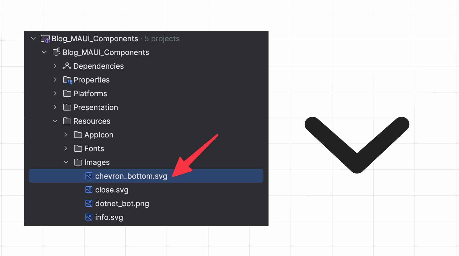
The first step is to add an image to our project, used as the icon for the PickerPopupLabel. Here is the picture I will use, named chevron_bottom.svg
Let’s add the property ActionIconSource for our PickerPopupLabel from the page PickerPopupPage:
–> Blog_MAUI_Components/Presentations/Pages/Pickers/PickerPopupPage.xaml
<base:ContentPageBase
    xmlns="http://schemas.microsoft.com/dotnet/2021/maui"
    xmlns:x="http://schemas.microsoft.com/winfx/2009/xaml"
    xmlns:ccl="clr-namespace:Blog_MAUI_Components.MAUI.CustomControls.Labels;
        assembly=Blog_MAUI_Components.MAUI"
    xmlns:base="clr-namespace:Blog_MAUI_Components.Presentation.Common"
    xmlns:page="clr-namespace:Blog_MAUI_Components.Presentation.Pages.Pickers"
    Title="Picker with Popup Demo"
    x:DataType="page:PickerPageViewModel"
    x:Class="Blog_MAUI_Components.Presentation.Pages.Pickers.PickerPopupPage">

    <Grid RowDefinitions="*,Auto" >
        <ScrollView>
            <VerticalStackLayout
                Margin="16, 32"
                Spacing="25">

                <ccl:PickerPopupLabel
                    Label="Country"
                    SelectedItem="{Binding Country}"
                    ItemsSource="{Binding CountriesLoader.Result}"
                    ItemDisplay="{x:Static
                        page:PickerPageViewModel.CountryDisplayProperty}"
                    TapCommand="{Binding CountrySelectedCommand}"
                    ShowLoader="{Binding CountriesLoader.ShowLoader}"
                    ActionIconSource="chevron_bottom.svg" />

            </VerticalStackLayout>
        </ScrollView>
    </Grid>
</base:ContentPageBase>
Our button is visible on the interface, but currently, clicking it doesn’t trigger any action!
In the case of a Picker, we don’t want to define an ActionIconCommand; instead, we want to open the popup, just as it would if we clicked on the rest of the component.
Customize ActionIcon behavior for PickerPopupLabel
We need to modify PickerPopupLabel to include this specific behavior:
- No ActionIconCommand Defined: If ActionIconCommand is not set, clicking on the image should automatically display the CollectionPopup.
- Default ActionIconSource: If no ActionIconSource is defined, the control should display chevron_bottom.png by default, as this is the desired common behavior for all PickerPopupLabel instances. This avoids code duplication and ensures a consistent experience.
- Hide the ActionIcon when in loading state: If the loading state is true, hide the ActionIcon image to avoid displaying both the icon and loading indicator simultaneously. The ActionIcon should reappear once loading is complete.
–> Blog_MAUI_Components/Presentations/Pages/Pickers/PickerPopupPage.xaml.cs
public partial class PickerPopupLabel
{
    private CollectionPopup? _collectionPopup;
    private readonly TapGestureRecognizer _tapGestureRecognizer;

    public PickerPopupLabel()
    {
        InitializeComponent();

        _tapGestureRecognizer = new TapGestureRecognizer();
        _tapGestureRecognizer.Tapped += OnTapped;

        GestureRecognizers.Add(_tapGestureRecognizer);
    }

    private void OnTapped(object? sender, EventArgs e)
    {
        _collectionPopup = new CollectionPopup
        {
            BindingContext = this,
            Title = !string.IsNullOrEmpty(Title) ? Title : Label,
            ItemsSource = ItemsSource,
            SelectedItem = SelectedItem,
            ItemDisplay = ItemDisplay,
        };

        _collectionPopup.SetBinding(CollectionPopup.SelectedItemProperty, "SelectedItem");
        _collectionPopup.SetBinding(CollectionPopup.ItemsSourceProperty, "ItemsSource");

        Shell.Current.ShowPopup(_collectionPopup);
    }

    protected override void OnBindingContextChanged()
    {
        base.OnBindingContextChanged();

        // Display default image if ActionIconSource is null.
        ActionIconSource ??= "chevron_bottom.png";
        // Add the action to display the CollectionPopup if ActionIconCommand is null.
        ActionIconCommand ??= new Command(() => OnTapped(null, EventArgs.Empty));
    }

    // The rest of the code: properties, methods.
}
public partial class LabelBase
{
    /// ...
    private void UpdateShowLoaderView()
    {
        LoaderActivityIndicator.IsVisible = ShowLoader;

        if (ActionIconSource is not null)
        {
            // Hide the ActionIconButton when the Loader is visible
            ActionIconButton.IsVisible = !ShowLoader;
        }
    }
    /// ...
}
Add ActionIcon for an EntryLabel
I will use another image to be used for an EntryLabel, named info.svg
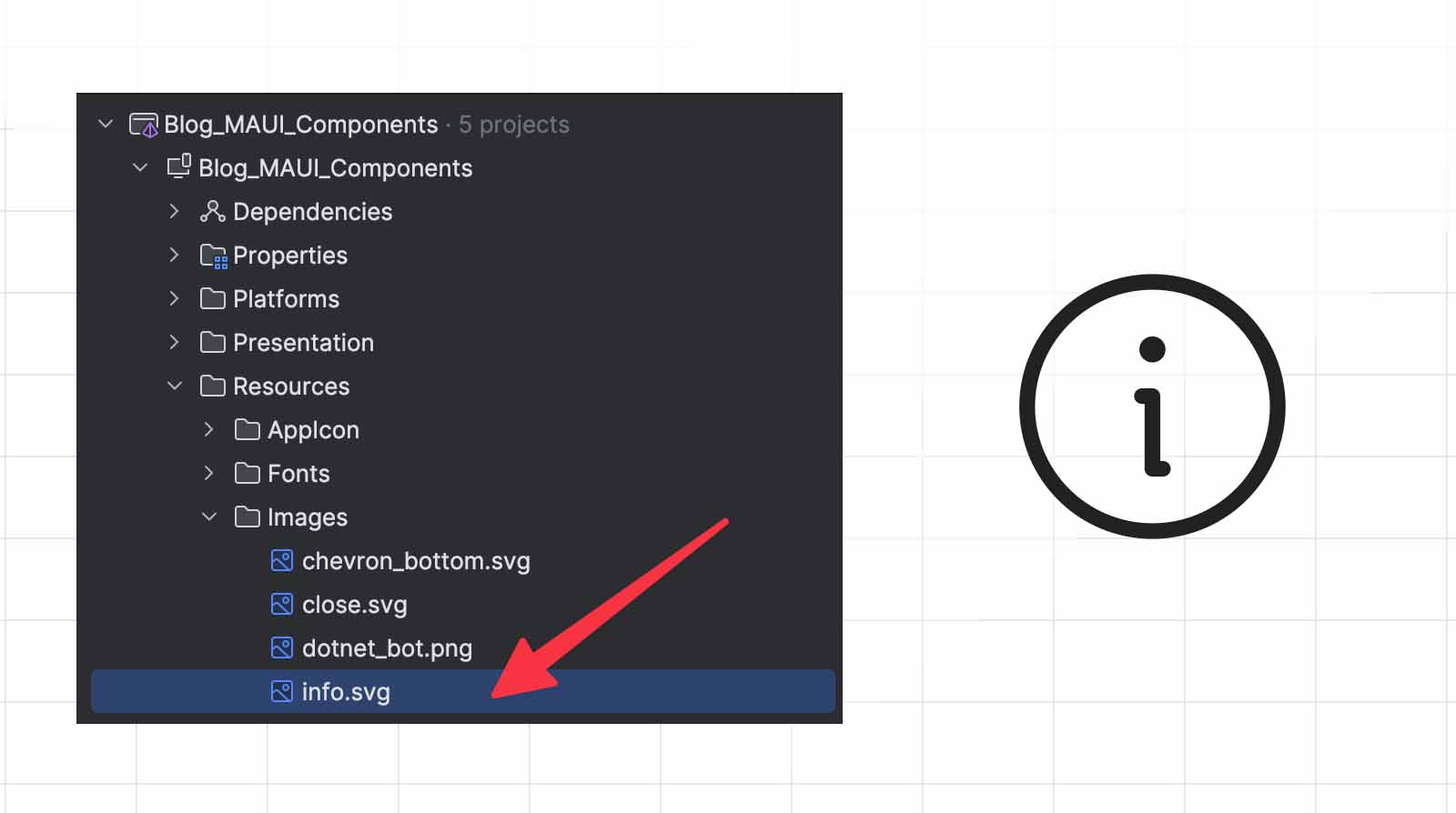
I’ll implement a straightforward behavior by adding a button to EntryLabel. When the user clicks this button, it will display a popup with information on how the provided data will be used.
Add a new DisplayService
To display the popup, we’ll use DisplayAlert from Microsoft.Maui.Controls. This method allows us to show a simple alert with a title, message, and action buttons.
Microsoft.Maui.Controls.Application.Current!.MainPage!
    .DisplayAlert(title, message, accept);
As I already explained in my previous articles, never referenced direct reference to Maui Controls API inside your ViewModel. It won’t be testable, and if you want to change the way to display a popup in your application, maybe using a thrird part package, you will have to refactor the whole code base.
The best practice is to encapsulate this code within a service. I’ll name it DisplayService, and it will be exposed through the IDisplayService interface. This approach improves testability and allows for easier modifications if we decide to change the popup implementation later.
–> Blog_MAUI_Components/Infrastructure/Displays/DisplayService.cs
public class DisplayService : IDisplayService
{
    public Task ShowPopupAsync(string title, string message, string accept = "OK")
    {
        return Microsoft.Maui.Controls.Application.Current!.MainPage!
            .DisplayAlert(title, message, accept);
    }
}
Update the DependencyInjection to add this new service inside the container.
–> Blog_MAUI_Components/Infrastructure/DependencyInjection.cs
public static class DependencyInjection
{
    public static IServiceCollection AddInfrastructure(this IServiceCollection services)
    {
        services.AddSingleton<INavigationService, NavigationService>();
        services.AddSingleton<IToastService, ToastService>();
        services.AddSingleton<IDisplayService, DisplayService>();

        return services;
    }
}
Update the EntryPage.xaml
Use IDisplayService in EntryPageViewModel to show a popup when the user clicks the information button on EntryLabel.
–> Blog_MAUI_Components/Presentations/Pages/Entry/EntryPageViewModel.cs
public partial class EntryPageViewModel : ViewModelBase
{
    private readonly ILogger<EntryPageViewModel> _logger;
    private readonly IToastService _toastService;
    private readonly IDisplayService _displayService;

    public EntryPageViewModel(
        ILogger<EntryPageViewModel> logger,
        IToastService toastService,
        IDisplayService displayService)
    {
        _logger = logger;
        _toastService = toastService;
        _displayService = displayService;

        _logger.LogInformation("Building EntryPageViewModel");
    }

     // Don't show Properties and Methods.

    [RelayCommand]
    private async Task FullnameInfo()
    {
        _logger.LogInformation("FullnameInfo()");

        await _displayService.ShowPopupAsync("Full name",
            "Your first name and last name are used for communication purpose.");
    }
}
Update EntryLabel with the following properties:
- ActionIconSource: Set to display the image info.svg
- ActionIconCommand: Bind to the FullnameInfoCommand command from the ViewModel.
–> Blog_MAUI_Components/Presentations/Pages/Entry/EntryPage.xaml
<base:ContentPageBase
    xmlns="http://schemas.microsoft.com/dotnet/2021/maui"
    xmlns:x="http://schemas.microsoft.com/winfx/2009/xaml"
    xmlns:ccl="clr-namespace:Blog_MAUI_Components.MAUI.CustomControls.Labels;
        assembly=Blog_MAUI_Components.MAUI"
    xmlns:page="clr-namespace:Blog_MAUI_Components.Presentation.Pages.Entry"
    xmlns:base="clr-namespace:Blog_MAUI_Components.Presentation.Common"
    Title="Entry Demo"
    x:DataType="page:EntryPageViewModel"
    x:Class="Blog_MAUI_Components.Presentation.Pages.Entry.EntryPage">

    <Grid RowDefinitions="*,Auto" >
        <ScrollView>
            <VerticalStackLayout
                Margin="16, 32"
                Spacing="25">

                <ccl:EntryLabel
                    Label="First name or Last name"
                    Text="{Binding FullName, Mode=TwoWay}"
                    Error="{Binding ValidationResult,
                        Converter={StaticResource ShowErrorConverter},
                        ConverterParameter={x:Static
                            page:EntryPageViewModelValidator.FullNameProperty}}"
                    IsRequired="True"
                    Placeholder="John Doe"
                    ActionIconSource="info.png"
                    ActionIconCommand="{Binding FullnameInfoCommand}"/>

            </VerticalStackLayout>
        </ScrollView>
    </Grid>
</base:ContentPageBase>
See it in action
Let’s see the EntryLabel and PickerPopupLabel in action.
Conclusion
The full code is available on GitHub, with a working example.
In this article, we enhanced our LabelBase control by adding properties to display an action button with an image (ActionIconSource) and a command (ActionIconCommand). This button provides additional interactivity, allowing users to execute business logic with a simple click.
We also implemented a custom behavior for PickerPopupLabel to display a default icon (chevron_bottom.png) and trigger a popup when the button is clicked, even if no command is specified.
Lastly, we created a DisplayService to manage popups independently, improving the testability and flexibility of our ViewModel. If you enjoyed this blog post, then follow me on LinkedIn, subscribe the newsletter so you don’t miss out on any future posts. Don’t forget to share this with your friends and colleagues who are interested in learning about this topic. Thank you 🥰
Happy coding!


