Intro
Disclaimer: This article is intended for an audience already familiar with MAUI. Explanations are concise and may be challenging for beginners.
Welcome to this series of articles where we’ll build a complete Design System library of custom controls in MAUI. When starting a new mobile project, you often face a key decision: use a third-party library or create controls yourself?
There’s no predefined choice, and only your team can make this decision based on your specific context. Do you need complex controls? Are your budget and team size limited? Do you have the time and enough experience to build custom controls? Each of these factors will guide your choice.
Why Choose a Custom Library?
Let’s consider an example: I’m part of a young startup focused on .NET development. We have a limited budget and a tight timeline to ship our product. Fortunately, our design is simple and mainstream, and the first version is targeting only Android. The open-source community offers strong and resilient advanced libraries, like Uranium UI.
If you decide to use a third-party library, consider the following points: licensing, the presence of experienced contributors, compatibility with the latest .NET versions, bug fix support and platform support.
In our case, building a custom library makes sense because our team has the expertise to create it. We prefer not to rely on third-party libraries to minimize project dependencies. Maintaining control over our codebase ensures a deterministic state. Be able to integrate future unexpected changes from the Product Owner, such as targeting the Windows platform, which a open-source library might not supported. Failing to consider these aspects could impact your development in the future.
Goal
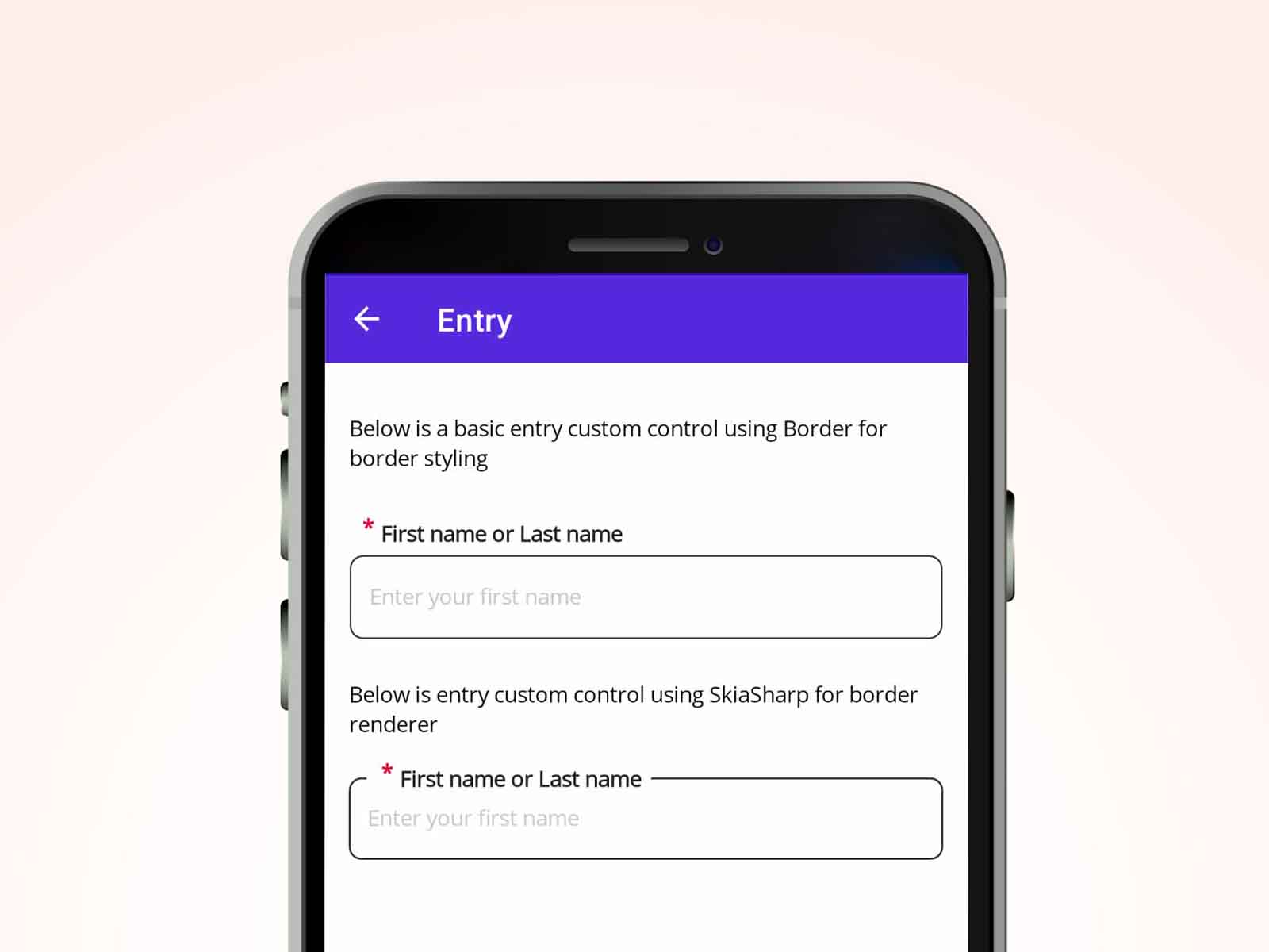
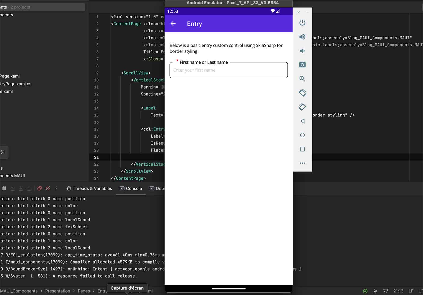
We’ll develop a simple custom entry and explore its limitations, then use SkiaSharp to create an adaptive border that fit the label size. The final result will look like this:
Setup
To get started, we’ll create a new solution with two projects. The first is a .NET MAUI App project, which contains pages to showcase the custom control in action. The second is a .NET MAUI Class Library project, where we’ll implement the custom control.
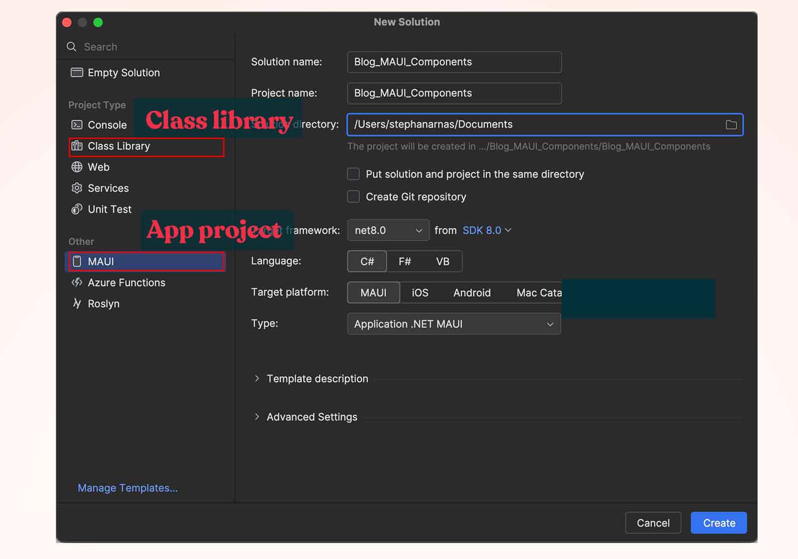
Why split into two separate projects? It’s a good architectural practice. Imagine in the future you need another application for a different use case. If all your controls are inside the application project, reusing them will not be possible. By placing them in a separate project, you can easily push the library to a private package manager like Azure Artifacts or a public one like NuGet.
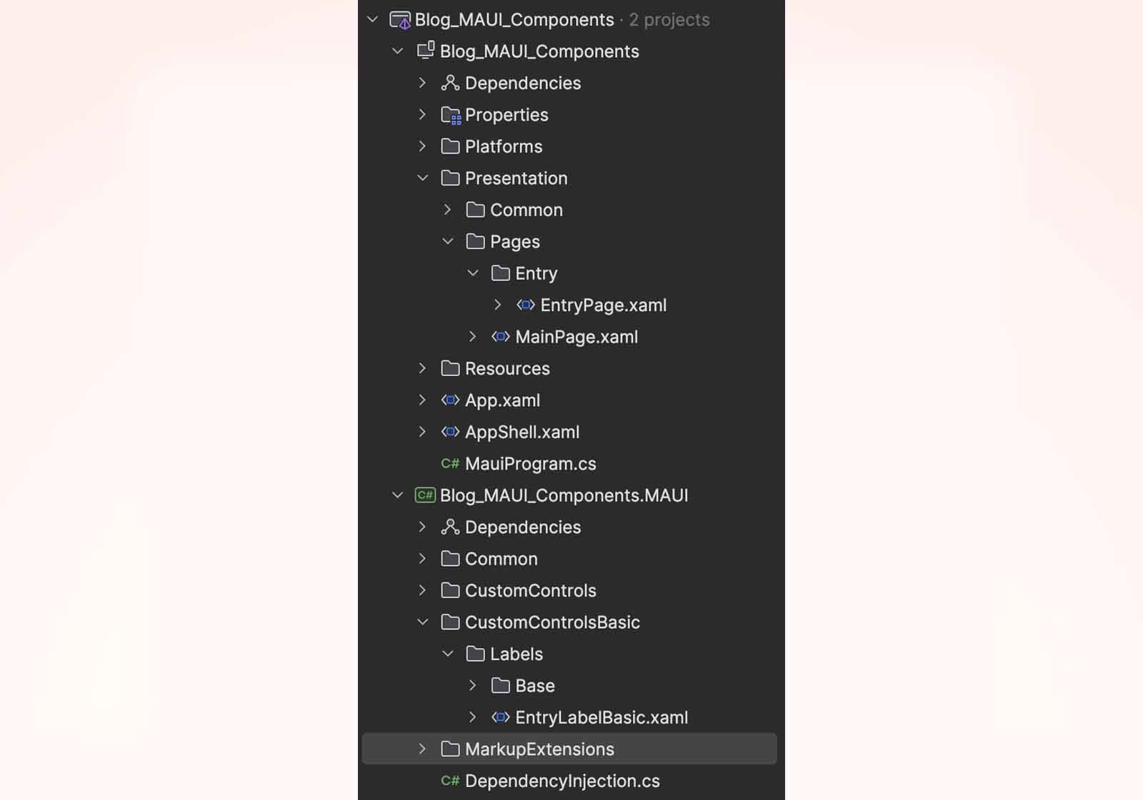
Once both projects are created, you can organize your elements by setting up the appropriate directories. Here’s how I organize my elements:
(I’ll provide the final structure once all elements are implemented; we’ll go through each of them as we progress through this post.)
Packages
Here is the list of packages that need to be installed in the projects.
App project (Blog_MAUI_Components)
- Microsoft.Maui.Controls
- Microsoft.Maui.Controls.Compatibility
Class library project (Blog_MAUI_Components.MAUI)
- Microsoft.Maui.Controls
- Microsoft.Maui.Controls.Compatibility
- SkiaSharp.Views.Maui.Controls
- SkiaSharp.Views.Maui.Core
Register services (MauiApp)
When installing the SkiaSharp package, we need to register the SkiaSharp services inside the MauiProgram. It’s good practice to create a class that registers all necessary services when developing a class library responsible for a specific task.
In the class library project, add a DependencyInjection.cs class to handle the registration of SkiaSharp:
–> Blog_MAUI_Components.MAUI/DependencyInjection.cs
public static class DependencyInjection
{
    public static MauiAppBuilder AddBlogComponents(this MauiAppBuilder builder)
    {
        builder.UseSkiaSharp();
        return builder;
    }
}
In your MauiProgram.cs, add a reference to the AddBlogComponents() method.
–-> Blog_MAUI_Components/MauiProgram.cs
public static MauiApp CreateMauiApp()
{
    var builder = MauiApp.CreateBuilder();
    builder
        .UseMauiApp<App>()
        .AddBlogComponents()
        .UseMauiCommunityToolkit()
        .ConfigureFonts(fonts =>
        {
            fonts.AddFont("OpenSans-Regular.ttf", "OpenSansRegular");
            fonts.AddFont("OpenSans-Semibold.ttf", "OpenSansSemibold");
        });

#if DEBUG
    builder.Logging.AddDebug();
#endif

    ApplyStyleCustomization();

    // Register your pages.
    Routing.RegisterRoute(RouteConstants.EntryPage, typeof(EntryPage));

    return builder.Build();
}

private static void ApplyStyleCustomization()
{
    // We will implement this method in the next section
}
Removing the default UI styling for the Entry
By default, when you define an Entry, you’ll notice it comes with a border on iOS and an underline on Android. We want an Entry control with no borders, no color, just the barebones of the control so we can handle the rest of the customization ourselves.
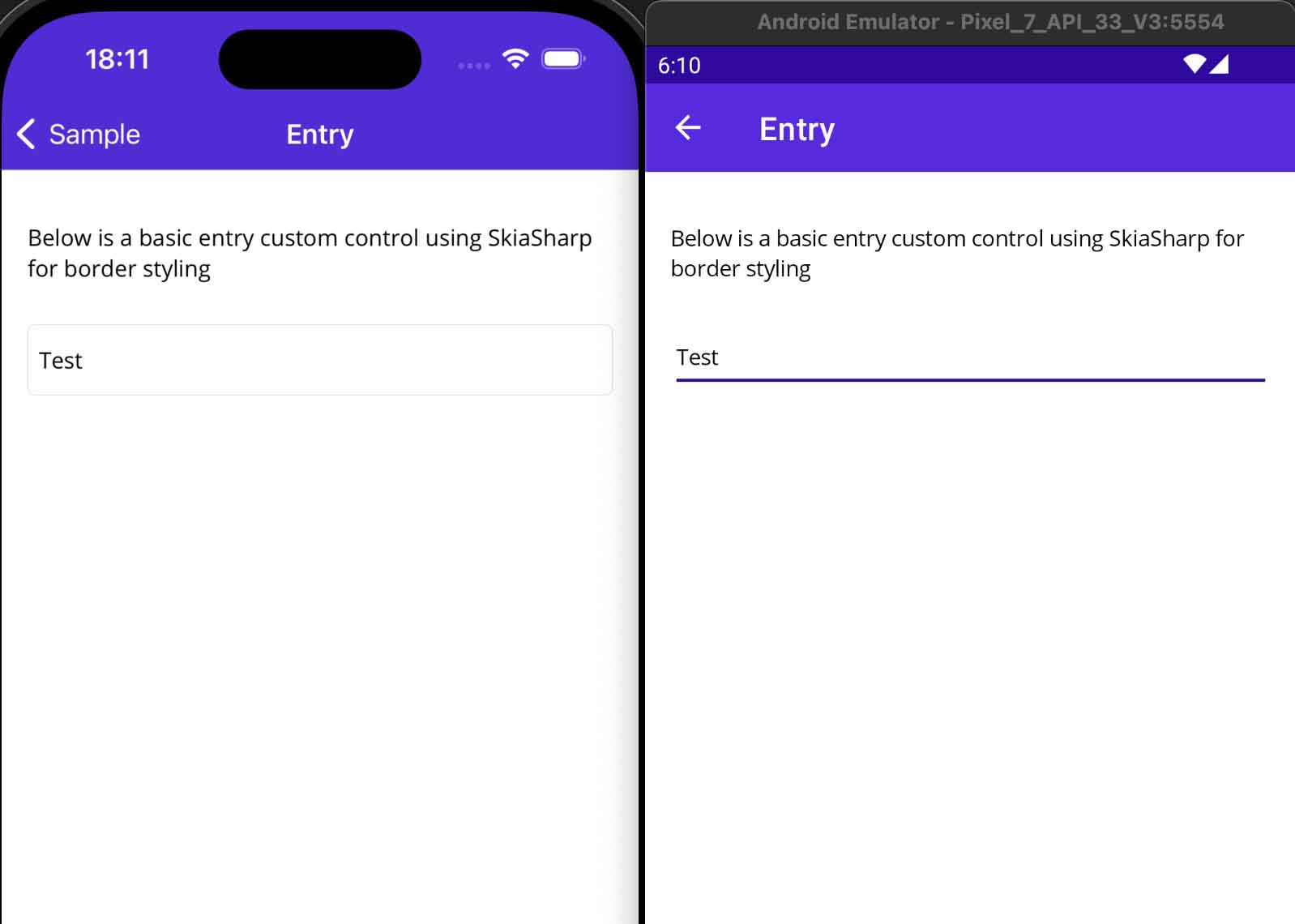
Part of this style comes from Resources/Styles.xaml, where you’ll find the default style overrides for MAUI controls. Take a look at the Entry, you’ll see definitions for TextColor, FontFamily, and even light and dark themes. It’s pretty cool how everything is set up. The first cleanup we’ll make is to comment out the BackgroundColor.
...
<Style TargetType="Entry">
    <Setter Property="TextColor" Value="{AppThemeBinding
        Light={StaticResource Black},
        Dark={StaticResource White}}" />
    <!--<Setter Property="BackgroundColor" Value="Transparent" />-->
    <Setter Property="FontFamily" Value="OpenSansRegular"/>
    <Setter Property="FontSize" Value="14" />
    <Setter Property="PlaceholderColor" Value="{AppThemeBinding
        Light={StaticResource Gray200},
        Dark={StaticResource Gray500}}" />
    <Setter Property="MinimumHeightRequest" Value="44"/>
    <Setter Property="MinimumWidthRequest" Value="44"/>
    <Setter Property="VisualStateManager.VisualStateGroups">
        <VisualStateGroupList>
            <VisualStateGroup x:Name="CommonStates">
                <VisualState x:Name="Normal" />
                <VisualState x:Name="Disabled">
                    <VisualState.Setters>
                        <Setter Property="TextColor" Value="
                            {AppThemeBinding
                                Light={StaticResource Gray300},
                                Dark={StaticResource Gray600}}" />
                    </VisualState.Setters>
                </VisualState>
            </VisualStateGroup>
        </VisualStateGroupList>
    </Setter>
</Style>
...
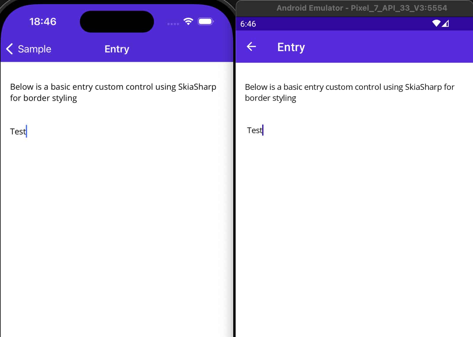
For now, nothing has really changed. Removing the underline will require using an EntryHandler. The code must be placed inside the App project; otherwise, it won’t work. You can place it in a separate file or method for cleaner code. I chose to create a method called ApplyStyleCustomization():
-–> Blog_MAUI_Components/MauiProgram.cs
private static void ApplyStyleCustomization()
{
    EntryHandler.Mapper.AppendToMapping("NoUnderline", (handler, _) =>
    {
#if __ANDROID__
        // Remove the underline from the EditText
        handler.PlatformView.SetBackgroundColor(Android.Graphics.Color.Transparent);
#endif
    });

    EntryHandler.Mapper.AppendToMapping("SetUpEntry", (handler, view) =>
    {
#if ANDROID

#elif IOS || MACCATALYST
        // Remove outline from the UITextField
        handler.PlatformView.BorderStyle = UIKit.UITextBorderStyle.None;
#elif WINDOWS

#endif
    });
}
Alright, here’s an explanation of what’s happening.
What is an EntryHandler? An EntryHandler is a class in .NET MAUI that acts as a bridge between the cross-platform MAUI Entry control and the native controls on each platform. The handler is responsible for mapping the properties, events, and methods of the MAUI control to the native control (e.g., UITextField on iOS, EditText on Android, and TextBox on Windows).
Why use EntryHandler.Mapper.AppendToMapping? The Mapper.AppendToMapping method allows you to customize or extend the behavior of the Entry control for specific platforms. By adding custom mappings like “NoUnderline” and “SetUpEntry”, you can modify how the Entry control is rendered and behaves on different platforms.
Now we’ve cleaned up the Entry control on both Android and iOS platforms.
Step-by-Step: Implementing the Custom Entry Control with Border
Step 1: Creating the LabelBase
We are building a library that combines a label with various controls like an entry, editor, switch, etc. I prefix my custom controls with ‘Label’. Today, we’ll focus on EntryLabel, and later, we could implement EditorLabel, LabelLabel, SwitchLabel, and more.
Before creating EntryLabel, we need to establish a common behavior for all our controls. To do this, we’ll create a LabelBase class that will serve as the foundation for shared behavior across all controls.
I created the following file LabelBase.xaml (Rider or Visual Studio will associate a LabelBase.xaml.cs file automatically; I named the control with “Basic” at the end because it’s a temporary version to demonstrate the evolution to a new one using SkiaSharp)
–> Blog_MAUI_Components.MAUI/CustomControlsBasic/Labels/Base/LabelBase.xaml
<Grid
    xmlns="http://schemas.microsoft.com/dotnet/2021/maui"
    xmlns:x="http://schemas.microsoft.com/winfx/2009/xaml"
    RowDefinitions="Auto,Auto"
    x:Class="Blog_MAUI_Components.MAUI.CustomControlsBasic.Labels.Base.LabelBase">

    <HorizontalStackLayout VerticalOptions="Start">
        <Label x:Name="RequiredLabel"
               Text="*"
               Style="{StaticResource BaseRequiredLabelLabel}" />

        <Label x:Name="LabelLabel"
               Style="{StaticResource BaseLabelLabel}" />
    </HorizontalStackLayout>

    <Border x:Name="BorderLabel" Grid.Row="1"
            Style="{StaticResource BaseBorderBasic}" />

</Grid>
–> Blog_MAUI_Components.MAUI/CustomControlsBasic/Labels/Base/LabelBase.xaml.cs
public partial class LabelBase
{
    public LabelBase()
    {
        InitializeComponent();
    }

    public static readonly BindableProperty ViewProperty =
        BindableProperty.Create("View", typeof(View), typeof(LabelBase),
        defaultValue: null, BindingMode.OneWay,
        ViewHelper.ValidateCustomView, ElementChanged);

    public View View
    {
        get => (View)GetValue(ViewProperty);
        set => SetValue(ViewProperty, value);
    }

    public static readonly BindableProperty IsRequiredProperty =
        BindableProperty.Create("IsRequired", typeof(bool), typeof(LabelBase),
        defaultValue: false, propertyChanged: IsRequiredChanged);

    public bool IsRequired
    {
        get => (bool)GetValue(IsRequiredProperty);
        set => SetValue(IsRequiredProperty, value);
    }

    public static readonly BindableProperty LabelProperty =
        BindableProperty.Create("Label",typeof(string), typeof(LabelBase),
        propertyChanged: LabelChanged);

    public string Label
    {
        get => (string)GetValue(LabelProperty);
        set => SetValue(LabelProperty, value);
    }

    private static void ElementChanged
        (BindableObject bindable, object oldValue, object newValue) =>
            ((LabelBase)bindable).UpdateElementView();
    private static void IsRequiredChanged
        (BindableObject bindable, object oldValue, object newValue) =>
            ((LabelBase)bindable).UpdateIsRequiredView();
    private static void LabelChanged
        (BindableObject bindable, object oldValue, object newValue) =>
            ((LabelBase)bindable).UpdateLabelView();

    private void UpdateElementView()
    {
        BorderLabel.Content = View;
        UpdateIsRequiredView();
    }

    private void UpdateIsRequiredView()
    {
        RequiredLabel.IsVisible = IsRequired;
    }

    private void UpdateLabelView()
    {
        LabelLabel.Text = Label;
        LabelLabel.IsVisible = !string.IsNullOrEmpty(Label);
    }
}
At this point, some explanations are necessary. As mentioned, we’re creating a custom control that combines a label with another control. Let’s go over the Bindable Properties:
- View: This property defines the associated control, which can be of any type.
- IsRequired: This property indicates whether the control requires a value, displaying a symbol to inform the user.
- Label: This property holds the value of the label.
About the XAML view, it’s quite simple:
- The base control is a Grid, chosen for its simplicity in organizing elements, its performance, and its ability to overlap elements when necessary.
- HorizontalStackLayout: This layout holds the LabelLabel and RequiredLabel. The RequiredLabel, which displays the ‘*’ symbol, informs the user if the control is required.
- Border Content: The Border.Content hosts the View. We’re using a Border to define padding, and in this version of the control, it also provides a border with a stroke and color.
You may notice that I’m using styles that are defined in the app project, not in the class library project. If you’re using Rider, you might see warnings because it can’t resolve the styles being defined in a different assembly. However, there will be no warnings during compilation, and everything will work as expected. To access the style resources, check the file on GitHub.
Step 2: Creating the EntryLabel
–> Blog_MAUI_Components.MAUI/CustomControlsBasic/Labels/EntryLabelBasic.xaml
<base:LabelBase
    xmlns="http://schemas.microsoft.com/dotnet/2021/maui"
    xmlns:x="http://schemas.microsoft.com/winfx/2009/xaml"
    xmlns:base="clr-namespace:Blog_MAUI_Components.MAUI.CustomControlsBasic.Labels.Base"
    x:Class="Blog_MAUI_Components.MAUI.CustomControlsBasic.Labels.EntryLabelBasic">

    <base:LabelBase.View>
        <Entry x:Name="Element" />
    </base:LabelBase.View>

</base:LabelBase>
–> Blog_MAUI_Components.MAUI/CustomControlsBasic/Labels/EntryLabelBasic.xaml.cs
public partial class EntryLabelBasic
{
    public EntryLabelBasic()
    {
        InitializeComponent();

        Element.SetVisualElementBinding();
        Element.SetBinding(Entry.TextProperty, "Text", BindingMode.TwoWay);
        Element.BindingContext = this;
    }

    public static readonly BindableProperty TextProperty =
        BindableProperty.Create("Text", typeof(string), typeof(EntryLabelBasic),
        propertyChanged: TextChanged, defaultBindingMode: BindingMode.TwoWay);

    public string Text
    {
        get => (string)GetValue(TextProperty);
        set => SetValue(TextProperty, value);
    }

    public static readonly BindableProperty PlaceholderProperty =
        BindableProperty.Create("Placeholder", typeof(string),
        typeof(EntryLabelBasic), propertyChanged: PlaceholderChanged);

    public string Placeholder
    {
        get => (string)GetValue(PlaceholderProperty);
        set => SetValue(PlaceholderProperty, value);
    }

    // Add more properties like Keyboard, ReturnType, ReturnCommand, etc.
    // Check the final project on GitHub at the bottom of this post.

    private static void TextChanged
        (BindableObject bindable, object oldValue, object newValue) =>
            ((EntryLabelBasic)bindable).UpdateTextView();
    private static void PlaceholderChanged
        (BindableObject bindable, object oldValue, object newValue) =>
            ((EntryLabelBasic)bindable).UpdatePlaceholderView();

    private void UpdateTextView() => Element.Text = Text;
    private void UpdatePlaceholderView() => Element.Placeholder = Placeholder;
}
I’m not going to explain all the BindableProperties, as most of them are self-explanatory and already exist in the Entry control. However, if your application needs more properties to extend the existing behavior, you’ll need to manually implement them. I’ve just exposed a few key properties.
The most important property is Text, which holds the value of the Entry. This property needs to be bound to Element.Text with a BindingMode of TwoWay. This binding is established in the constructor.
The SetVisualElementBinding() method in the constructor is responsible for binding the IsEnabled and IsVisible properties to the Entry, ensuring that it behaves as expected (Check the file on GitHub).
Finally the view is pretty simple, define the control you want to bind with the Label, it’s going to be pretty simple to go with an Editor, Switch or whatever control.
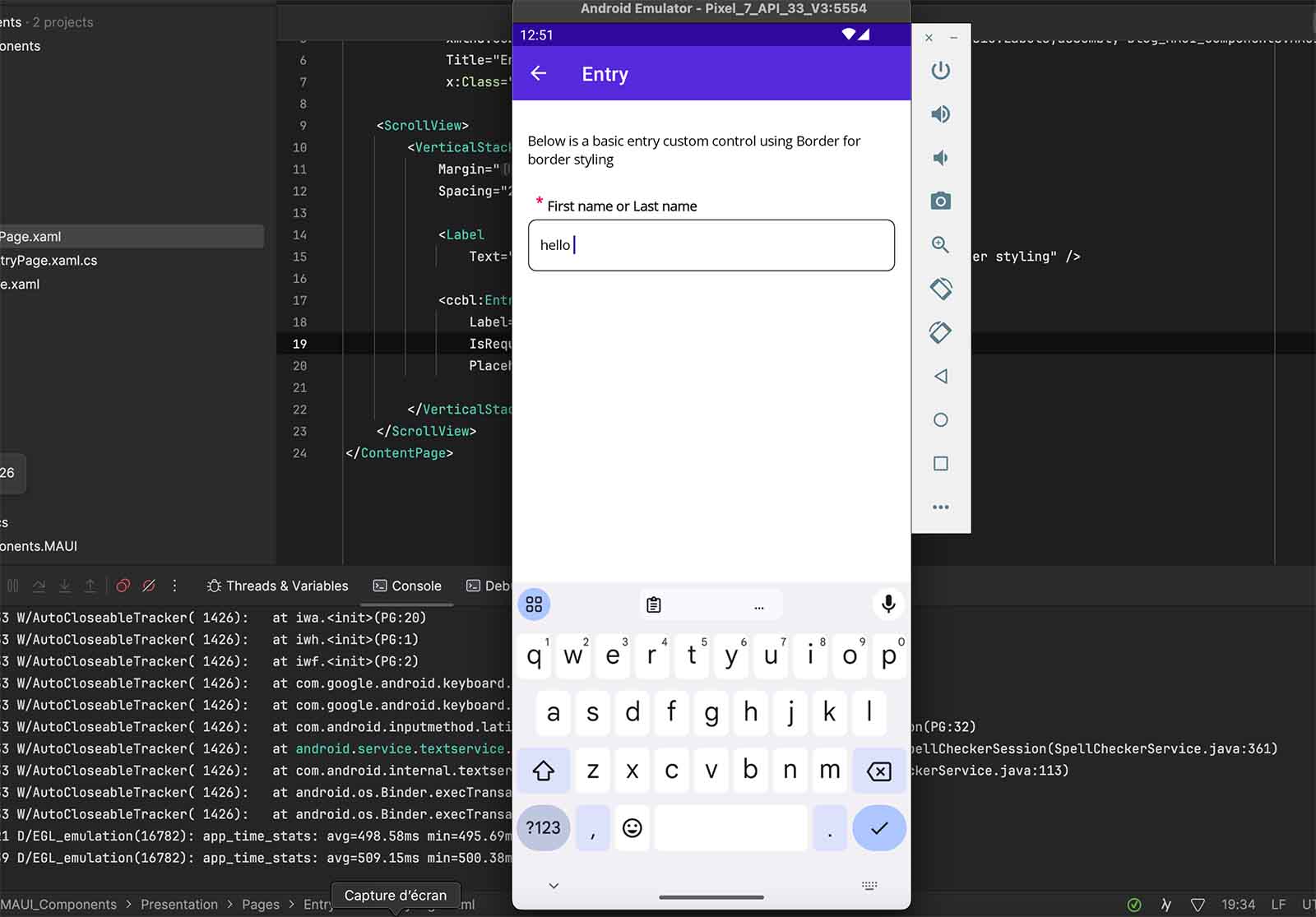
Add a page to display the Entry control
Create a new page to display our fresh new control. Import the correct namespace for the assembly. I’ve named it ccbl, following a naming convention derived from the control folder: Custom Control Basic Labels (ccbl).
–> Blog_MAUI_Components/Presentation/Pages/Entry/EntryPage.xaml
<ContentPage xmlns="http://schemas.microsoft.com/dotnet/2021/maui"
             xmlns:x="http://schemas.microsoft.com/winfx/2009/xaml"
             xmlns:cclb="clr-namespace:Blog_MAUI_Components.MAUI.CustomControlsBasic.Labels;assembly=Blog_MAUI_Components.MAUI"
             x:Class="Blog_MAUI_Components.Presentation.Pages.Entry.EntryPage">

    <VerticalStackLayout Margin="16, 32" Spacing="25">

        <cclb:EntryLabelBasic
            Label="First name or Last name"
            IsRequired="True"
            Placeholder="Enter your first name" />

    </VerticalStackLayout>
</ContentPage>
Step-by-Step: Implementing the Custom Entry Control with SkiaSharp
Why using SkiaSharp?
The control we created might be sufficient for your needs. However, your designer may not agree and would like a slight modification. You’ve already seen the final result in the Goal section at the beginning of this post. The label needs to move down, and the border should be outlined. It seems simple and straightforward on Figma, but implementing that is a different challenge.
The simpliest approach is moving down the label and adding a background with the same color of your background color page. It makes the tricks, so why not?
I have a news for you, your mobile application will grow, your pages could have multiple section with difference background color. If you keep the current implementation, you’ll need to provide a background color for your control that matches the parent’s background color. It feels like a patch, adding confusion and potentially introducing bugs due to the wrong color being used. Sometimes, the parent background color differs slightly, and these differences might not be perceptible on all screens. Believe me, I’ve been in this situation 😃.
Step 1: Skeleton of the border
I know you were waiting for this section since a while. Before to dig into the code, let’s have a visual representation of the shapes we are going to draw. We are going to draw Arcs and Lines to create the border. The right segment of the top line should be dynamic and calculated based of the size of the label.
Step 2: Calculate X position for the right segment of the top line
First of all, we need to calculate the width of the label considering the proportion of the entire canvas’s width.
// Measure the Label's width
float labelWidth = (float)LabelLabel.Width * e.Info.Width / (float)BorderCanvasView.Width;
// Measure the '*' width when the Label is required.
float isRequiredWidth = RequiredLabel.IsVisible
    ? (float)RequiredLabel.Width * e.Info.Width / (float)BorderCanvasView.Width
    : 0;
- LabelLabel.Width: This is the actual width of the LabelLabel control.
- e.Info.Width: This represents the width of the SKCanvasView.
- BorderCanvasView.Width: This is the width of the BorderCanvasView that contains the SKCanvasView.
I defined a rectangle (SKRect) to represent the area where the lines and arcs will be drawn on the canvas. This will be useful for accessing the left, top, right, and bottom position values.
var rect = new SKRect(
            borderThickness,
            borderThickness,
            e.Info.Width - borderThickness,
            e.Info.Height - borderThickness
        );
Now we can calculate the X position for the top line’s right segment, which is composed of various values: I’m using labelExtraSpace to add extra space between the label and the border, as it wouldn’t look good if the border were too close to the label.
// Calculate the X position correctly for the top line right segment
float topLineRightSegmentStartX =
    rect.Left + radius + labelExtraSpace + isRequiredWidth + labelWidth + labelExtraSpace;
In this calculation, the radius represents the corner radius of the arcs, but it’s important to note that radius doesn’t directly correspond to the exact value of the angle drawn. The radius may need to be adjusted to ensure that the drawn shapes align perfectly.
Step 3: Draw Lines and Arcs with SkiaSharp
// Define the style of the drawn
var paint = new SKPaint();

// Draw an Arc
canvas.DrawArc(new SKRect(left, top, right, bottom),
    startAngle: 0, sweepAngle: 90, useCenter: false, paint);

// Draw a line
canvas.DrawLine(x0, y0, x1, y1, paint);
Step 4: Full code in action
–> Blog_MAUI_Components.MAUI/CustomControls/Labels/EntryLabel.xaml
<Grid
    xmlns="http://schemas.microsoft.com/dotnet/2021/maui"
    xmlns:x="http://schemas.microsoft.com/winfx/2009/xaml"
    xmlns:skia="clr-namespace:SkiaSharp.Views.Maui.Controls;assembly=SkiaSharp.Views.Maui.Controls"
    x:Class="Blog_MAUI_Components.MAUI.CustomControls.Labels.Base.LabelBase"
    Margin="0, 10, 0, 0">

   <HorizontalStackLayout VerticalOptions="Start"  Margin="12, -13, 0, 0">
       <Label x:Name="RequiredLabel" Text="*"
              Style="{StaticResource BaseRequiredLabelLabel}" />

       <Label x:Name="LabelLabel" Style="{StaticResource BaseLabelLabel}" />
   </HorizontalStackLayout>

   <skia:SKCanvasView x:Name="BorderCanvasView" PaintSurface="OnCanvasViewPaintSurface" />

   <Border x:Name="BorderLabel" Style="{StaticResource BaseBorder}" />

</Grid>
–> Blog_MAUI_Components.MAUI/CustomControls/Labels/EntryLabel.xaml.cs
public partial class LabelBase
{
    public LabelBase()
    {
        InitializeComponent();
    }

    // ...
    // Properties View, IsRequired, Label remains the same
    // as written on the file : EntryLabelBasic.xaml.cs.
    // We are completing our code with OnCanvasViewPaintSurface()
    // ...

    private void OnCanvasViewPaintSurface(object sender, SKPaintSurfaceEventArgs e)
    {
        var canvas = e.Surface.Canvas;
        canvas.Clear(); // Clear the canvas

        var paint = new SKPaint
        {
            Style = SKPaintStyle.Stroke,
            Color = ResourceHelper.GetResource<Color>("Gray900").ToSKColor(),
            StrokeWidth = 3,
            IsAntialias = true // Smooth edges
        };

        const float radius = 20f;
        const float fixedSegmentLength = (float)GutterSystem.SmallSpaceValue;
        float borderThickness = paint.StrokeWidth / 2;

        // Define the full rectangle based on the canvas size
        var r = new SKRect(
            borderThickness,
            borderThickness,
            e.Info.Width - borderThickness,
            e.Info.Height - borderThickness
        );

        // Measure the Label's width
        float labelWidth =
            (float)LabelLabel.Width * e.Info.Width / (float)BorderCanvasView.Width;

        float isRequiredWidth = RequiredLabel.IsVisible
            ? (float)RequiredLabel.Width * e.Info.Width / (float)BorderCanvasView.Width
            : 0;

        // Calculate endX correctly
        float endX = r.Left + radius + fixedSegmentLength + labelWidth +
            isRequiredWidth + fixedSegmentLength;

        // Draw the top-left arc
        canvas.DrawArc(
            new SKRect(r.Left, r.Top, r.Left + 2 * radius, r.Top + 2 * radius),
            startAngle: 180, sweepAngle: 90, useCenter: false, paint);

        // Draw the top-right arc
        canvas.DrawArc(
            new SKRect(r.Right - 2 * radius, r.Top, r.Right, r.Top + 2 * radius),
            startAngle: 270, sweepAngle: 90, useCenter: false, paint);

        // Draw the bottom-right arc
        canvas.DrawArc(
            new SKRect(r.Right - 2 * radius, r.Bottom - 2 * radius, r.Right, r.Bottom),
            startAngle: 0, sweepAngle: 90, useCenter: false, paint);

        // Draw the bottom-left arc
        canvas.DrawArc(
            new SKRect(r.Left, r.Bottom - 2 * radius, r.Left + 2 * radius, r.Bottom),
            startAngle: 90, sweepAngle: 90, useCenter: false, paint);

        // Draw the left segment of the top line with a fixed segment length
        canvas.DrawLine(
            r.Left + radius, r.Top, r.Left + radius + fixedSegmentLength, r.Top, paint);

        // Draw the right segment of the top line from the end
        // of the label to the top-right arc
        canvas.DrawLine(endX, r.Top, r.Right - radius, r.Top, paint);

        // Draw the right line between the top-right and bottom-right arcs
        canvas.DrawLine(r.Right, r.Top + radius, r.Right, r.Bottom - radius, paint);

        // Draw the bottom line between the bottom-right and bottom-left arcs
        canvas.DrawLine(r.Left + radius, r.Bottom, r.Right - radius, r.Bottom, paint);

        // Draw the left line between the bottom-left and top-left arcs
        canvas.DrawLine(r.Left, r.Top + radius, r.Left, r.Bottom - radius, paint);
    }
}
Result
Conclusion and source code
The full code is available on GitHub, with a working example.
In this article, we’ve explored how to extend a basic entry control in MAUI by combining it with a label and enhancing it with a custom SkiaSharp border. We’ve walked through the process of creating a flexible and reusable component that can adapt to different UI needs while considering the potential challenges that may arise during implementation.
By building on this foundation, you can create a variety of custom controls tailored to your application’s specific requirements. Remember, while simple solutions may work for small projects, taking the time to implement robust and adaptable controls will pay off as your application grows in complexity.
If you enjoyed this blog post, then follow me on LinkedIn, subscribe the newsletter so you don’t miss out on any future posts. Don’t forget to share this with your friends and colleagues who are interested in learning about this topic. Thank you 🥰
Happy coding!


