Intro
Disclaimer: This article is intended for an audience already familiar with MAUI. Explanations are concise and may be challenging for beginners.
Welcome to this series of articles where we’ll build a complete Design System library of custom controls in MAUI. This article builds on the previous one, MAUI (CraftUI Part 2) Info & Error states with FluentValidation.
To recap, we created a custom entry split into two files:
- LabelBase, which contains the properties and behaviors inherited by all controls.
- EntryLabel, which extends LabelBase by customizing properties and behaviors specific to the entry control.
Goal
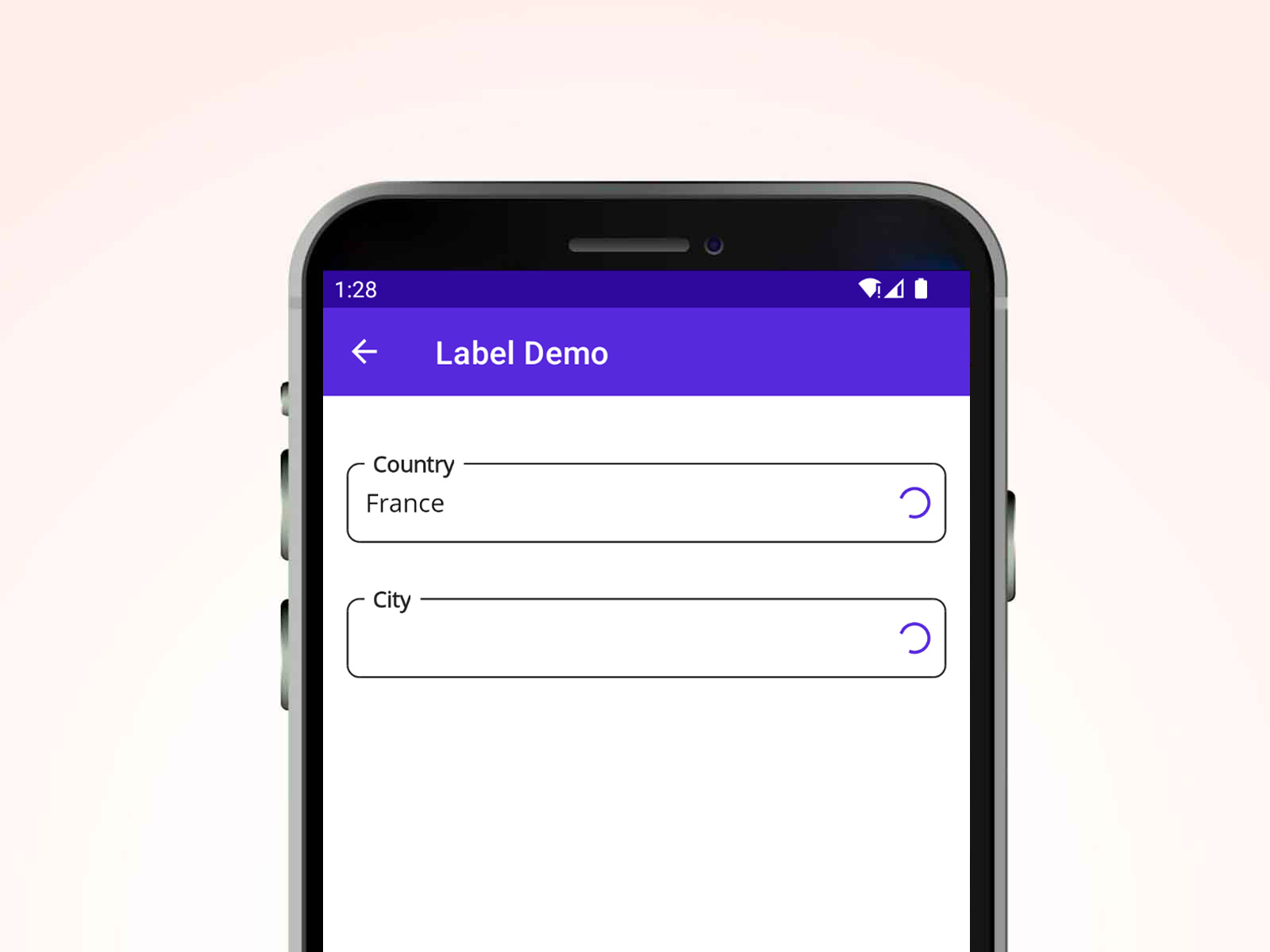
We’ll implement the loading state within the LabelBase control (which will apply to our EntryLabel) and create the PickerLabel control. The final result will look like this:
Add Loading state in LabelBase
Loading state will be displayed using the ActivityIndicator control.
This ActivityIndicator will extend to any control that inherits from LabelBase, ensuring consistent behavior across all derived controls.
–> Blog_MAUI_Components.MAUI/CustomControls/Labels/Base/LabelBase.xaml
<Grid
    RowDefinitions="Auto,Auto,Auto">

// Label ...

<skia:SKCanvasView
    x:Name="BorderCanvasView"
    PaintSurface="OnCanvasViewPaintSurface" />

<Border
    x:Name="BorderLabel"
    Style="{StaticResource BaseBorder}" />

// InfoLabel and ErrorLabel ...

<ActivityIndicator
    x:Name="LoaderActivityIndicator"
    IsVisible="False"
    IsRunning="True"
    HorizontalOptions="End"
    VerticalOptions="Center"
    WidthRequest="24"
    HeightRequest="24"
    Margin="0,0, 8, 0"
    Color="{StaticResource Primary}"/>

</Grid>
It is essential to set the visibility of ActivityIndicator to false by default ensuring they remain hidden until content is provided.
Feel free to adapt the visual appearance of Loading ActivityIndicator to the standards of your design system.
Add a Bindable Property named ShowLoader in the code behind to control the visibility of the ActivityIndicator.
–> Blog_MAUI_Components.MAUI/CustomControls/Labels/Base/LabelBase.xaml.cs
public partial class LabelBase
{
    // ...

    public static readonly BindableProperty ShowLoaderProperty =
        BindableProperty.Create("ShowLoader", typeof(bool), typeof(LabelBase),
        defaultValue: false, propertyChanged: ShowLoaderChanged);

    public bool ShowLoader
    {
        get => (bool)GetValue(ShowLoaderProperty);
        set => SetValue(ShowLoaderProperty, value);
    }

    // ...

    private static void ShowLoaderChanged
        (BindableObject bindable, object oldValue, object newValue) =>
            ((LabelBase)bindable).UpdateShowLoaderView();

    private void UpdateShowLoaderView()
    {
        LoaderActivityIndicator.IsVisible = ShowLoader;
    }

    // ...
}
Create the PickerLabel control
The same way we created EntryLabel, we’ll now create a new file for PickerLabel to encapsulate our Picker control.
I prefer to define the style inside the control, as it’s closely tied to the control and enhances readability for developers.
–> Blog_MAUI_Components.MAUI/CustomControls/Labels/PickerLabel.xaml
<base:LabelBase
    xmlns="http://schemas.microsoft.com/dotnet/2021/maui"
    xmlns:x="http://schemas.microsoft.com/winfx/2009/xaml"
    xmlns:base="clr-namespace:Blog_MAUI_Components.MAUI.CustomControls.Labels.Base"
    xmlns:page="clr-namespace:Blog_MAUI_Components.MAUI.CustomControls.Labels"
    x:Class="Blog_MAUI_Components.MAUI.CustomControls.Labels.PickerLabel">

    <base:LabelBase.Resources>
        <Style x:Key="PickerLabel" TargetType="Picker">
            <Setter Property="FontSize" Value="16" />
            <Setter Property="TextColor" Value="{StaticResource Gray950}" />
            <Setter Property="VerticalOptions" Value="Center" />
            <Setter Property="VerticalTextAlignment" Value="Center" />
            <Setter Property="HorizontalOptions" Value="Fill" />
            <Setter Property="MinimumHeightRequest" Value="40" />
        </Style>
    </base:LabelBase.Resources>

    <base:LabelBase.View>
        <Picker x:Name="Element"
                Style="{StaticResource PickerLabel}" >
        </Picker>
    </base:LabelBase.View>
</base:LabelBase>
–> Blog_MAUI_Components.MAUI/CustomControls/Labels/PickerLabel.xaml.cs
public partial class PickerLabel
{
    public PickerLabel()
    {
        InitializeComponent();

        Element.SetVisualElementBinding();
        Element.SetBinding(Picker.ItemsSourceProperty, nameof(ItemsSource));
        Element.SetBinding(Picker.SelectedItemProperty, nameof(SelectedItem));
        Element.BindingContext = this;
    }

    public static readonly BindableProperty ItemsSourceProperty =
        BindableProperty.Create(nameof(ItemsSource), typeof(IList), typeof(PickerLabel),
        propertyChanged: OnItemsSourceChanged);

    public IList ItemsSource
    {
        get => (IList)GetValue(ItemsSourceProperty);
        set => SetValue(ItemsSourceProperty, value);
    }

    public static readonly BindableProperty SelectedItemProperty =
        BindableProperty.Create(nameof(SelectedItem), typeof(object), typeof(PickerLabel),
        null, BindingMode.TwoWay, propertyChanged: OnSelectedItemChanged);

    public object SelectedItem
    {
        get => GetValue(SelectedItemProperty);
        set => SetValue(SelectedItemProperty, value);
    }

    public static readonly BindableProperty ItemDisplayBindingProperty =
        BindableProperty.Create(nameof(ItemDisplayBinding), typeof(string),
        typeof(PickerLabel), propertyChanged: OnItemDisplayBindingChanged,
        defaultBindingMode: BindingMode.OneWay);

    public string ItemDisplayBinding
    {
        get => (string)GetValue(ItemDisplayBindingProperty);
        set => SetValue(ItemDisplayBindingProperty, value);
    }

    public static readonly BindableProperty TapCommandProperty =
        BindableProperty.Create(nameof(TapCommand), typeof(ICommand),
        typeof(PickerLabel));

    public ICommand? TapCommand
    {
        get => (ICommand?)GetValue(TapCommandProperty);
        set => SetValue(TapCommandProperty, value);
    }

    private static void OnItemsSourceChanged
        (BindableObject bindable, object oldValue, object newValue) =>
            ((PickerLabel)bindable).OnItemsSourceChanged();
    private static void OnSelectedItemChanged
        (BindableObject bindable, object oldValue, object newValue) =>
            ((PickerLabel)bindable).OnSelectedItemChanged();
    private static void OnItemDisplayBindingChanged
        (BindableObject bindable, object oldValue, object newValue) =>
            ((PickerLabel)bindable).OnItemDisplayBindingChanged();

    private void OnItemsSourceChanged()
    {
        Element.ItemsSource = ItemsSource;
    }

    private void OnSelectedItemChanged()
    {
        Element.SelectedItem = SelectedItem;
        TapCommand?.Execute(null);
    }

    private void OnItemDisplayBindingChanged()
    {
        Element.ItemDisplayBinding = new Binding(ItemDisplayBinding);
    }
}
Some explanations of the BindableProperty.
- ItemsSource: List of items (like cities or countries in my example below) to the Picker. When the list changes, the Picker automatically updates.
- SelectedItem: Selected item in the Picker, so you always know what the user has chosen.
- ItemDisplayBinding: Specifies which property from the item model object should be displayed in the Picker, like showing the name of a city instead of its ID.
- TapCommand: Command triggered when the user selects an item in the Picker. This allows you to execute specific logic right after a selection is made.
Removing the default UI styling for the Picker
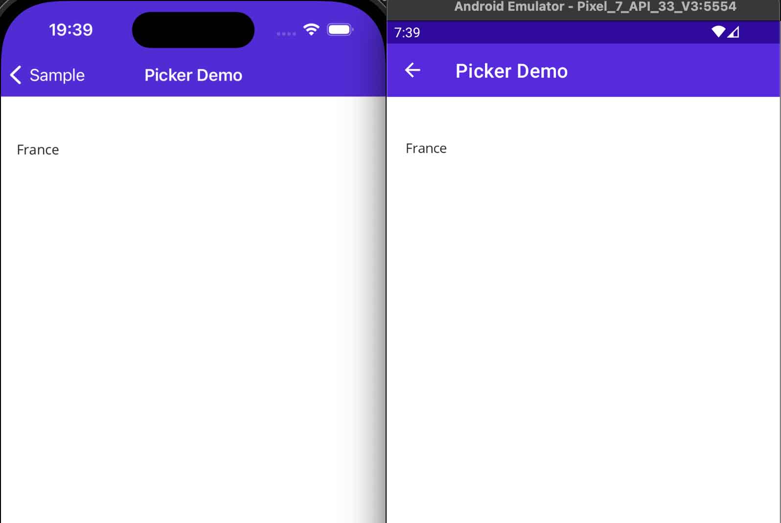
By default, when you define an Picker, you’ll notice it comes with a border on iOS and an underline on Android. We want a Picker control with no borders, no color, just the barebones of the control so we can handle the rest of the customization ourselves.
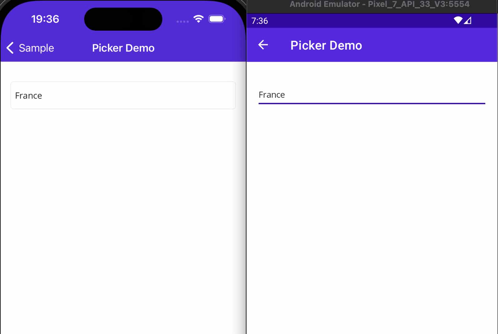
Removing the underline will require using an PickerHandler. For more details on how a Handler works, read this article Create a Custom Entry using SkiaSharp.
–-> Blog_MAUI_Components/MauiProgram.cs
private static void ApplyStyleCustomization()
{
    // Remove the underline from the Entry ...

    PickerHandler.Mapper.AppendToMapping("NoUnderline", (handler, _) =>
    {
#if ANDROID
    // Remove the underline from the Spinner (Picker)
    handler.PlatformView.Background = null;
#endif
    });

    PickerHandler.Mapper.AppendToMapping("SetUpPicker", (handler, _) =>
    {
#if ANDROID
    // Set the background to transparent
    handler.PlatformView.Background = null;
#elif IOS || MACCATALYST
    // Remove border for the UITextField (Picker)
    if (handler.PlatformView is UIKit.UITextField textField)
    {
        textField.BorderStyle = UIKit.UITextBorderStyle.None;
    }
#elif WINDOWS

#endif
    });
}
Now we’ve cleaned up the Picker control on both Android and iOS platforms.
Display PickerLabel in a page
I won’t showing you the basic use of a Picker control with a list of string values. I’m going further to illustrate a concrete example that you might come across in a real-life business application.
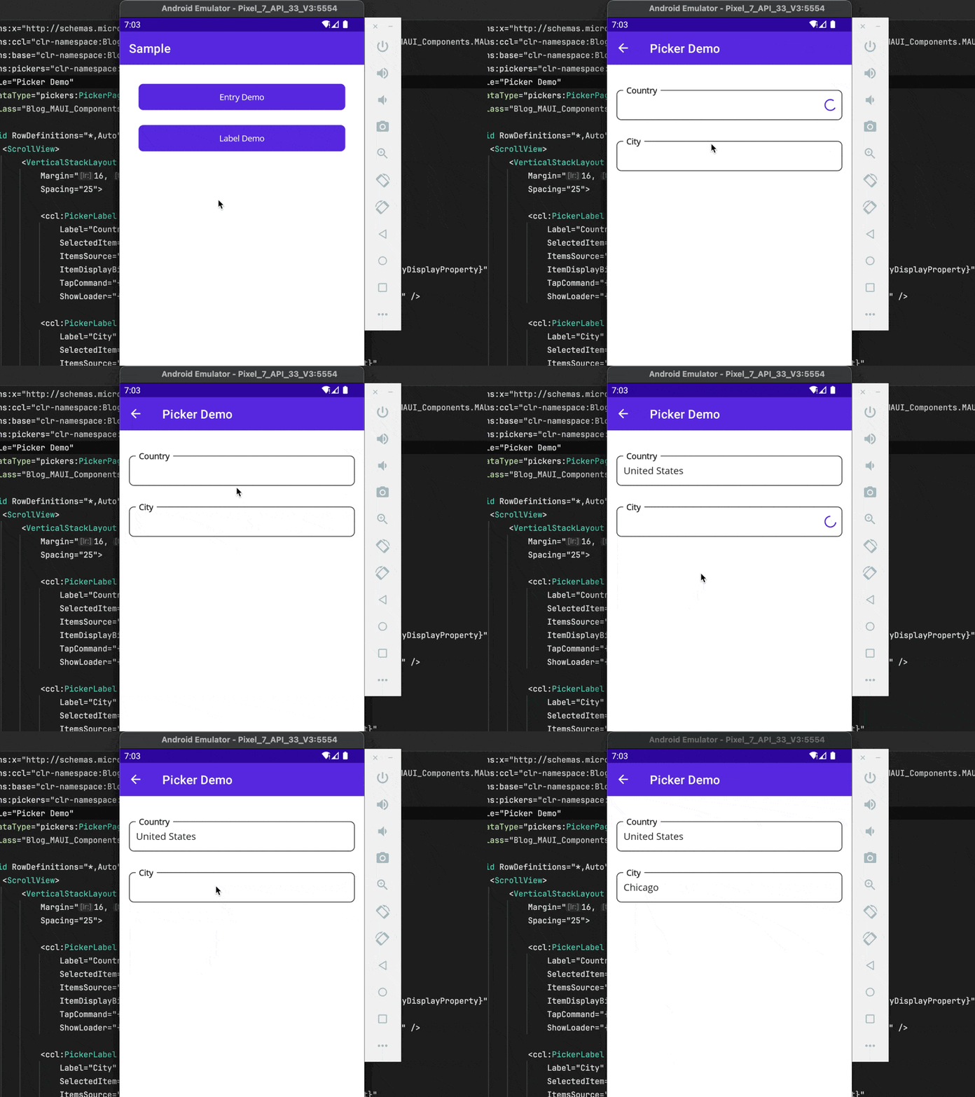
- The scenario starts by loading a list of countries when the page is displayed.
Typically, you would request a business API, but to keep things simple, we’ll simulate the HTTP request by returning a static list with a delay. - When the user selects a country, we’ll load the list of cities associated with that country.
- While the Picker data is loading, a loader will show to inform the user about the loading state.
One more thing, I am using TaskLoaderNotifier from the package Sharpnado.Maui.TaskLoaderView.
An article about the TaskLoaderNotifier will be written to dive deeper into this implementation.
The benefit is the data returned by the data layer are encapsulated in the TaskLoaderNotifier. The TaskLoaderNotifier exposed a set of properties to handle all UI states (Loading, Error, Result, Notification) and removes all the pain of async loading from your view models (Try/Catch, Async Void, IsBusy, HasErrors, Base ViewModels, etc.).
–-> Blog_MAUI_Components/Presentation/Pages/Pickers/PickerPageViewModel.cs
public partial class PickerPageViewModel : ViewModelBase
{
    private readonly ILogger<PickerPageViewModel> _logger;
    private readonly ICityService _cityService;
    private readonly ICountryService _countryService;

    // The selected Country from the Picker.
    [ObservableProperty]
    private CountryVm? _country;

    // The selected City from the Picker.
    [ObservableProperty]
    private CityVm? _city;

    public static string CountryDisplayProperty => nameof(CountryVm.Name);
    public static string CityDisplayProperty => nameof(CityVm.Name);

    public TaskLoaderNotifier<IReadOnlyCollection<CountryVm>> CountriesLoader
        { get; } = new();
    public TaskLoaderNotifier<IReadOnlyCollection<CityVm>> CitiesLoader
        { get; } = new();

    public PickerPageViewModel(
        ILogger<PickerPageViewModel> logger,
        ICityService cityService,
        ICountryService countryService)
    {
        _logger = logger;
        _cityService = cityService;
        _countryService = countryService;

        _logger.LogInformation("Building LabelPageViewModel");
    }

    public override void ApplyQueryAttributes(IDictionary<string, object> query)
    {
        _logger.LogInformation("ApplyQueryAttributes( query: {Query} )", query);

        base.ApplyQueryAttributes(query);
    }

    public override void OnAppearing()
    {
        _logger.LogInformation("OnAppearing()");

        if (CountriesLoader.IsNotStarted)
        {
            // We just navigate to the page, we load the data.
            CountriesLoader.Load(_ => LoadCountriesAsync());
        }

        base.OnAppearing();
    }

    public override void OnDisappearing()
    {
        _logger.LogInformation("OnDisappearing()");

        base.OnDisappearing();
    }

    private async Task<IReadOnlyCollection<CountryVm>> LoadCountriesAsync(
        CancellationToken cancellationToken = default)
    {
        _logger.LogInformation("LoadCountriesAsync()");

        var domainResult = await _countryService.GetAllCountriesAsync(cancellationToken);
        _logger.LogInformation("Items loaded: {Count}", domainResult.Count);

        return domainResult;
    }

    private async Task<IReadOnlyCollection<CityVm>> LoadCitiesByCountry(
        CancellationToken cancellationToken = default)
    {
        _logger.LogInformation("LoadCitiesByCountry()");

        if (Country is null)
        {
            // Add a toast to enhance the user experience.
            return Array.Empty<CityVm>();
        }

        var domainResult = await _cityService
            .GetCitiesAsync(Country.Id, cancellationToken);
        _logger.LogInformation("Items loaded: {Count}", domainResult.Count);

        return domainResult;
    }

    [RelayCommand]
    private Task CountrySelected()
    {
        _logger.LogInformation("CountrySelected()");

        City = null;
        // Reset clean the data contained in CitiesLoader.Result.
        // The IsNotStarted return to true.
        CitiesLoader.Reset();
        CitiesLoader.Load(_ => LoadCitiesByCountry());

        return Task.CompletedTask;
    }
}
- Page Load: When the page is loaded (OnAppearing),
CountriesLoader.IsNotStartedis true so CountriesLoader starts loading the list of countries. During this process, the ShowLoader property is set to true, displaying a loading indicator in the UI. - Selecting a Country: When a user selects a country, the CountrySelectedCommand is triggered. This command resets the CitiesLoader, cleaning the data and starts loading the cities associated with the selected country. While cities are loading, a loading indicator is displayed in the UI.
–> Blog_MAUI_Components/Presentation/Pages/Pickers/PickerPage.xaml
<base:ContentPageBase
    xmlns="http://schemas.microsoft.com/dotnet/2021/maui"
    xmlns:x="http://schemas.microsoft.com/winfx/2009/xaml"
    xmlns:ccl="clr-namespace:Blog_MAUI_Components.MAUI.CustomControls.Labels;assembly=Blog_MAUI_Components.MAUI"
    xmlns:base="clr-namespace:Blog_MAUI_Components.Presentation.Common"
    xmlns:pickers="clr-namespace:Blog_MAUI_Components.Presentation.Pages.Pickers"
    Title="Label Demo"
    x:DataType="pickers:PickerPageViewModel"
    x:Class="Blog_MAUI_Components.Presentation.Pages.Pickers.PickerPage">

    <Grid RowDefinitions="*,Auto" >
        <ScrollView>
            <VerticalStackLayout
                Margin="16, 32"
                Spacing="25">

                <ccl:PickerLabel
                    Label="Country"
                    SelectedItem="{Binding Country}"
                    ItemsSource="{Binding CountriesLoader.Result}"
                    ItemDisplayBinding="{x:Static
                        pickers:PickerPageViewModel.CountryDisplayProperty}"
                    TapCommand="{Binding CountrySelectedCommand}"
                    ShowLoader="{Binding CountriesLoader.ShowLoader}" />

                <ccl:PickerLabel
                    Label="City"
                    SelectedItem="{Binding City}"
                    ItemsSource="{Binding CitiesLoader.Result}"
                    ItemDisplayBinding="{x:Static
                        pickers:PickerPageViewModel.CityDisplayProperty}"
                    ShowLoader="{Binding CitiesLoader.ShowLoader}" />

            </VerticalStackLayout>
        </ScrollView>
    </Grid>
</base:ContentPageBase>
Let’s explore how the properties of the City PickerLabel interact with the ViewModel.
- SelectedItem: Bind to the City property in the ViewModel. This property holds the currently selected city from the picker.
- ItemsSource: Bind to the result of the CitiesLoader. The CitiesLoader.Result contains the list of cities that will be displayed in the picker.
- ItemDisplayBinding: Specifies which property of the CityVm model should be displayed in the picker.
We use a static property in the PickerPageViewModel instead of specifying the property as a string, like ItemDisplayBinding=”Name”. Hardcoding the property name makes your code less refactorable and increases the risk of introducing regressions. - ShowLoader: Bind to the ShowLoader property of the CitiesLoader.
We can see the output result below.
Prevent the PickerLabel opening if it contains no data
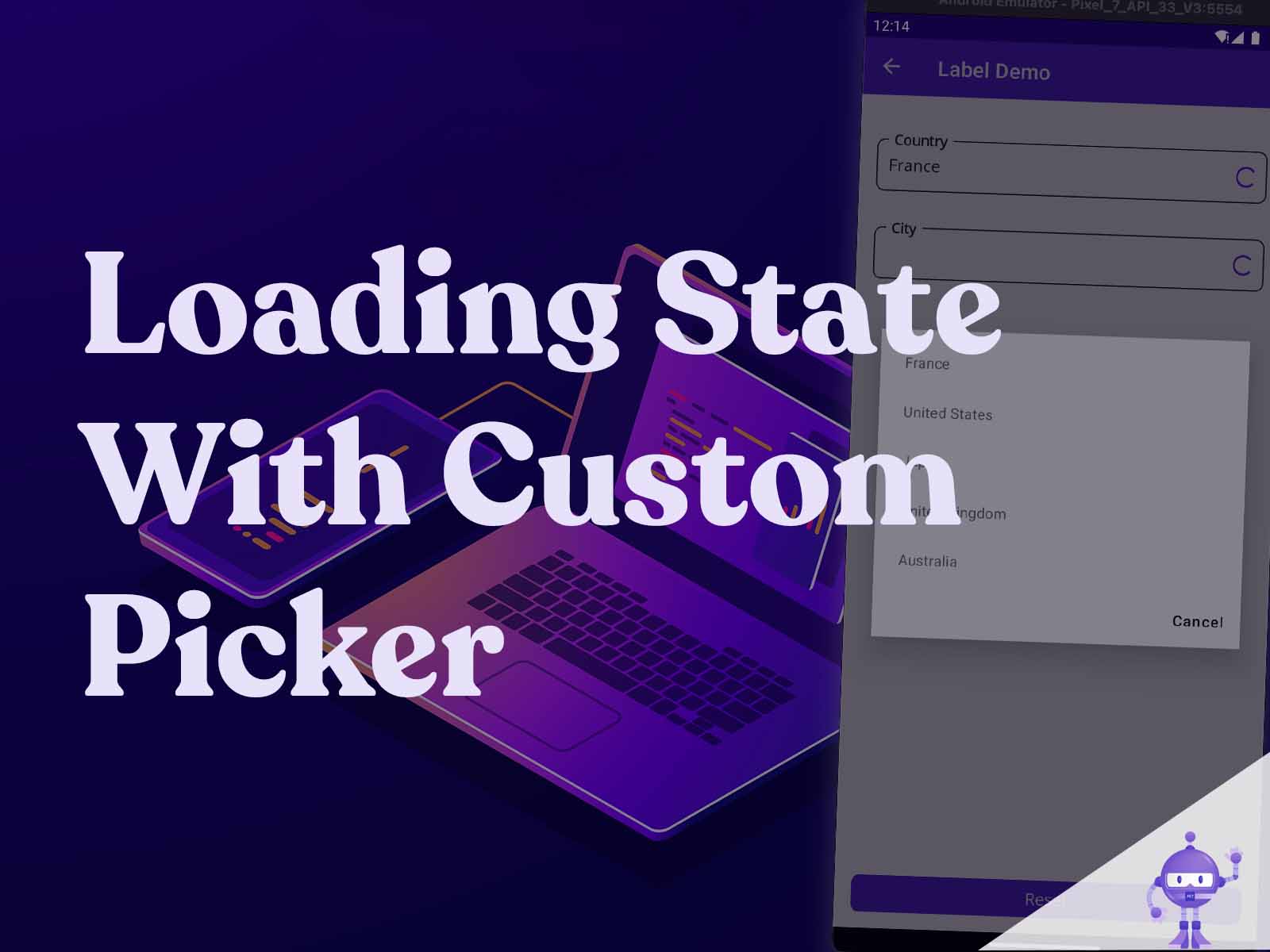
If you pay attention, when the PickerLabel contains no data or is in a loading state, clicking on it will still open the Picker, displaying an empty UI like this:
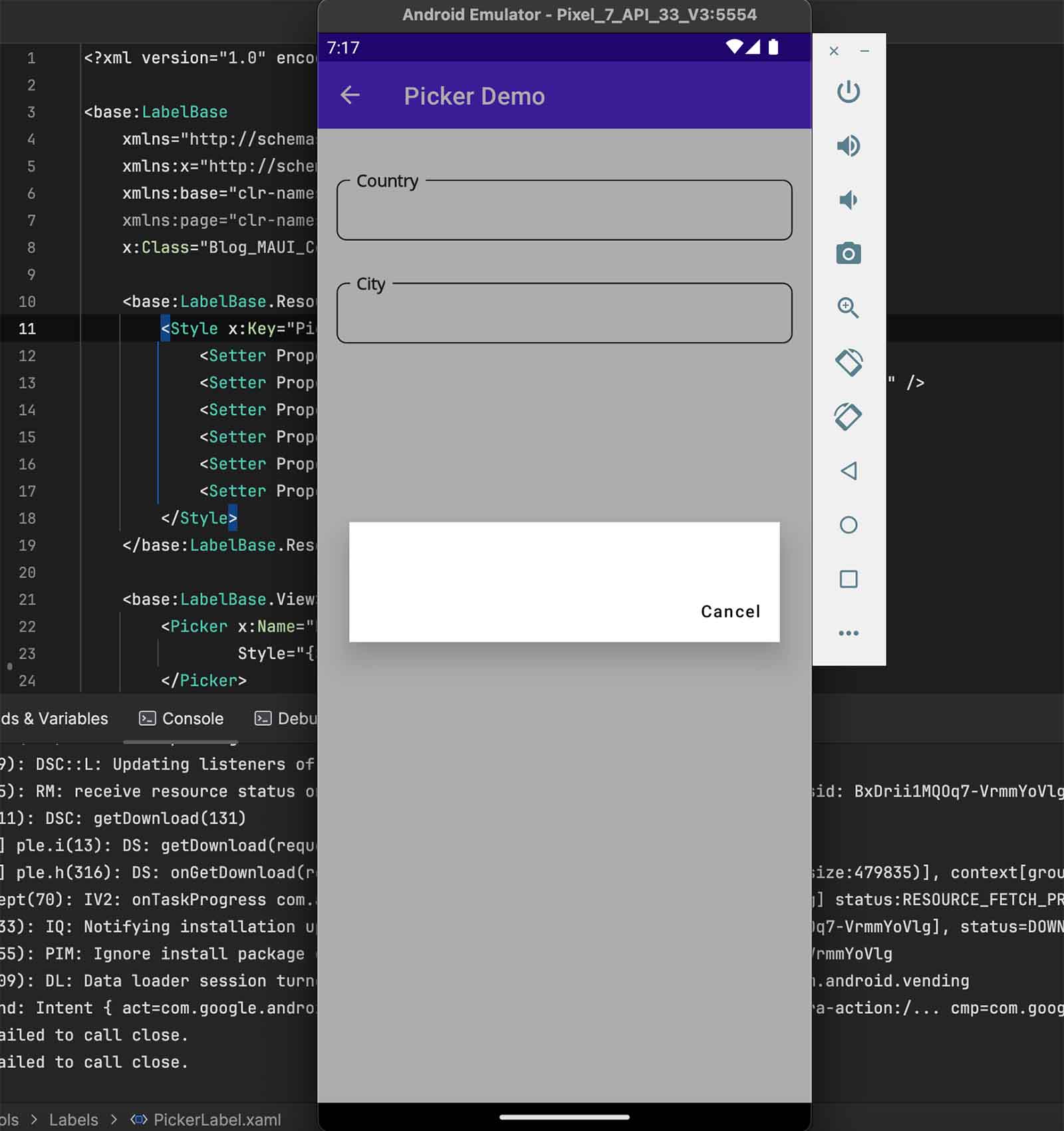
This is the expected behavior of the Picker, there is no property or method to prevent this case of empty data. It’s not very user-friendly and can be confusing.
There are several ways to work around this behavior to prevent the Picker from displaying its content when there is no data.
You could disable the Picker, but I won’t choose this solution because when a Picker is disabled, its appearance changes due to the VisualState defined in the Styles.xaml file.
I recommend adding a TapGestureRecognizer to the Picker.
This way, when the Tap event is triggered, we can check if the Picker’s ItemsSource is null or empty.
If it is, we do nothing; if not, we call Focus() to display the content.
Call Unfocus() before Focus(), otherwise the Picker content will only show once.
–> Blog_MAUI_Components/Presentation/Pages/Pickers/PickerPage.xaml
<base:LabelBase
    xmlns="http://schemas.microsoft.com/dotnet/2021/maui"
    xmlns:x="http://schemas.microsoft.com/winfx/2009/xaml"
    xmlns:base="clr-namespace:Blog_MAUI_Components.MAUI.CustomControls.Labels.Base"
    xmlns:page="clr-namespace:Blog_MAUI_Components.MAUI.CustomControls.Labels"
    x:Class="Blog_MAUI_Components.MAUI.CustomControls.Labels.PickerLabel">

    // Style.

    <base:LabelBase.View>
        <Picker x:Name="Element"
                Style="{StaticResource PickerLabel}" >
            <Picker.GestureRecognizers>
                <TapGestureRecognizer Tapped="OnPickerTapped" />
            </Picker.GestureRecognizers>
        </Picker>
    </base:LabelBase.View>
</base:LabelBase>
–> Blog_MAUI_Components/Presentation/Pages/Pickers/PickerPage.xam.cs
public partial class PickerLabel
{
    public PickerLabel()
    {
        InitializeComponent();

        Element.SetVisualElementBinding();
        Element.SetBinding(Picker.ItemsSourceProperty, nameof(ItemsSource));
        Element.SetBinding(Picker.SelectedItemProperty, nameof(SelectedItem));
        Element.BindingContext = this;
    }

    private void OnPickerTapped(object sender, EventArgs e)
    {
        if (Element.ItemsSource == null || !Element.ItemsSource.Cast<object>().Any())
        {
            // The Picker has no items, so we don't want to show an empty Picker dialog.
            return;
        }

        Element.Unfocus();
        Element.Focus();
    }

    // Bindable properties ...
}
Conclusion
The full code is available on GitHub, with a working example.
In this article, we expanded our custom MAUI controls library by adding a PickerLabel control and implementing a robust loading state mechanism that applies across all derived controls. We demonstrated how to create a seamless user experience by ensuring that the Picker only opens when it contains data, avoiding potential confusion with empty pickers.
Additionally, we leveraged the TaskLoaderNotifier to simplify async data loading, ensuring that our ViewModel handles UI states like Loading, Error, and Result efficiently. This approach not only enhances the functionality of our controls but also maintains clean, maintainable code, which is crucial for real-world enterprise applications.
An article about the TaskLoaderNotifier will be written to dive deeper into this implementation.
If you enjoyed this blog post, then follow me on LinkedIn, subscribe the newsletter so you don’t miss out on any future posts. Don’t forget to share this with your friends and colleagues who are interested in learning about this topic. Thank you 🥰
Happy coding!


